ArcticDB
An identity with scale
In the competitive world of fintech, differentiation can be everything. We recently partnered with ArcticDB, a technology product incubated within Man Group - a leading alternative investment management firm based in London - to craft an identity that both fits in and stands out. ArcticDB was born from a pressing internal need: to manage the ever-growing volume and complexity of front-office research data. It’s a powerful platform that transforms the way Man Group’s investment teams handle data at scale - a challenge faced by many large institutions today.
For ArcticDB, the challenge was clear: develop a brand that reflects cutting-edge technology, embodies trust in a skeptical market and carries professionalism and emotion into decisions that can be high-stake and extremely personal.
Their brand also had to mirror the spirit of their team: talented, collaborative and driven to solve the most complex problems. This culture of turning complexity into clarity through innovation and openness became the foundation of their brand’s DNA.

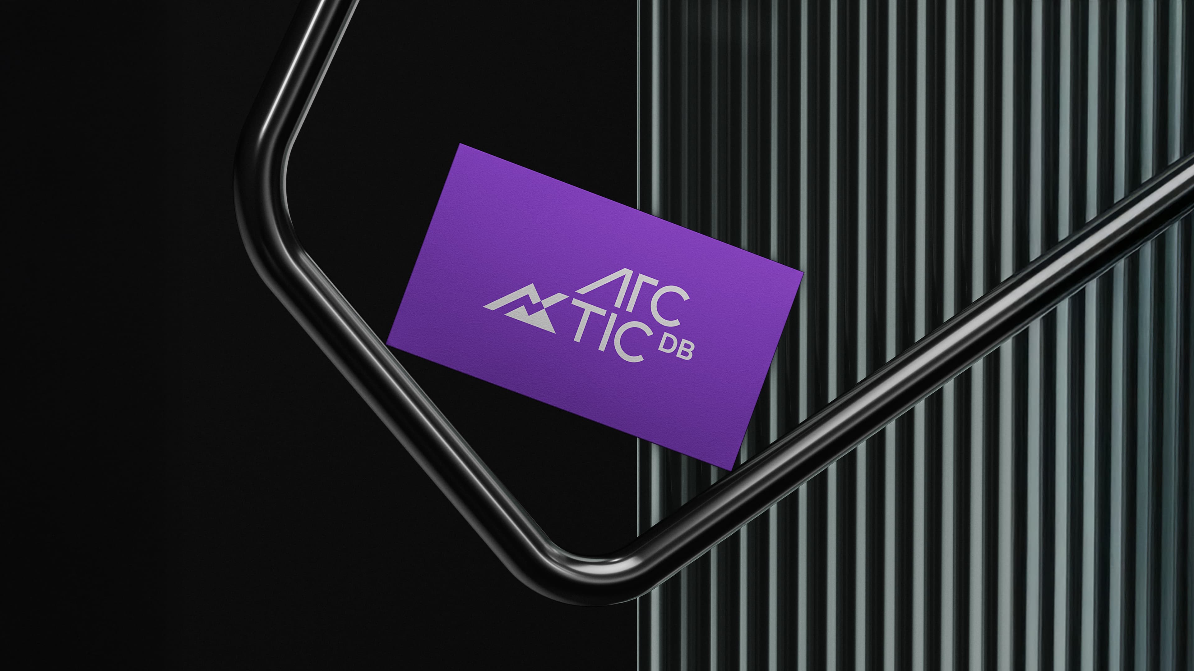
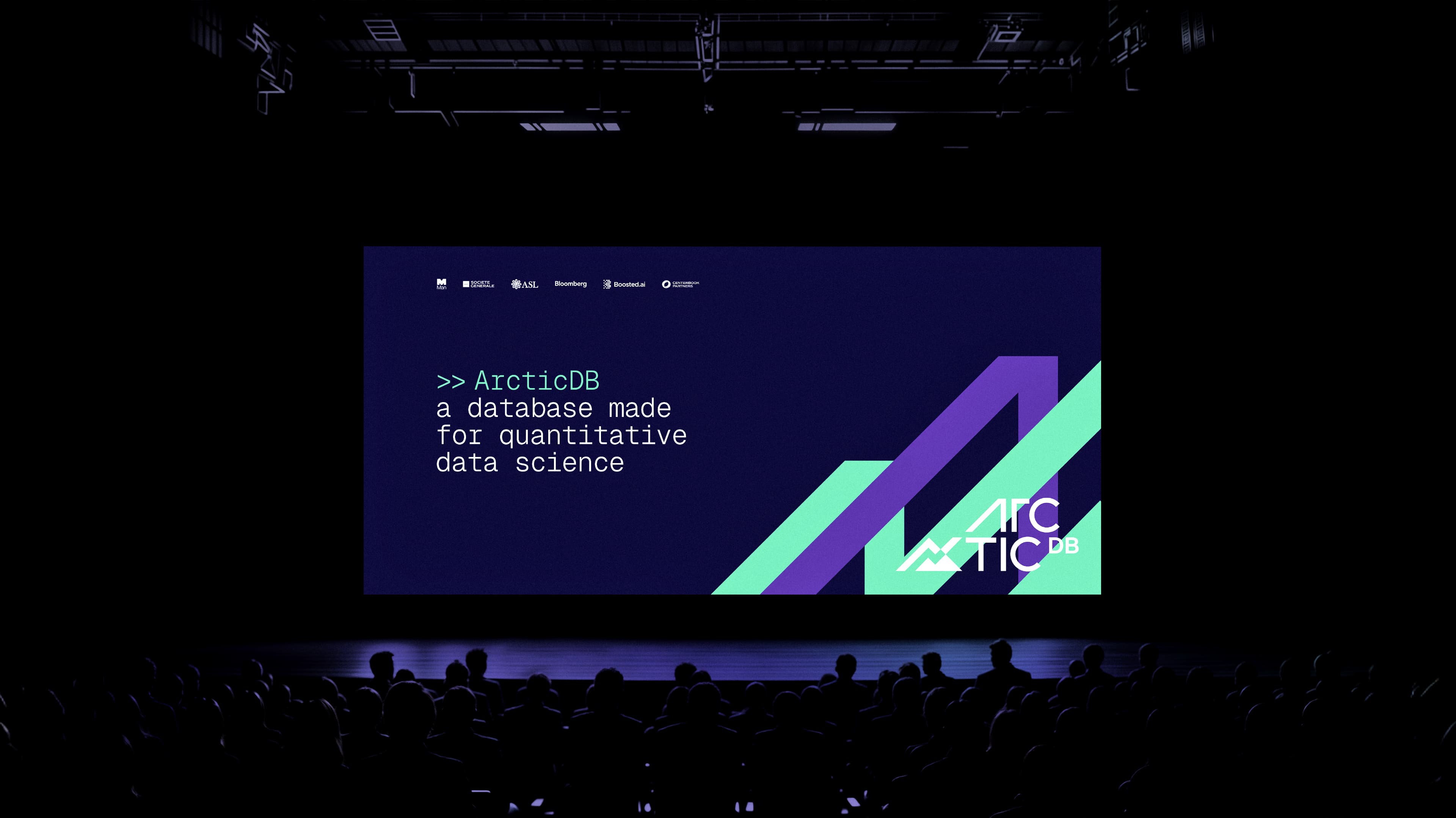
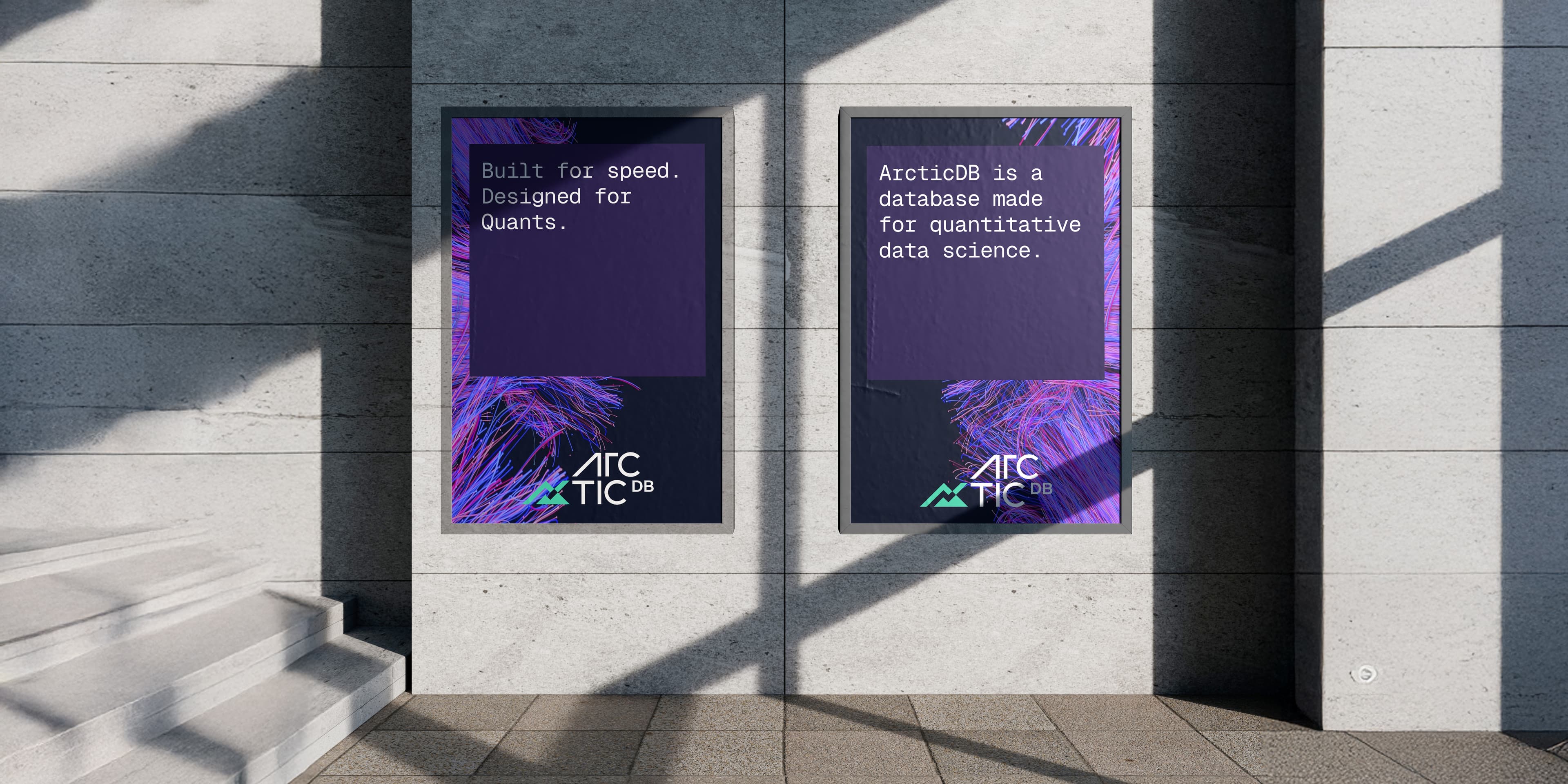
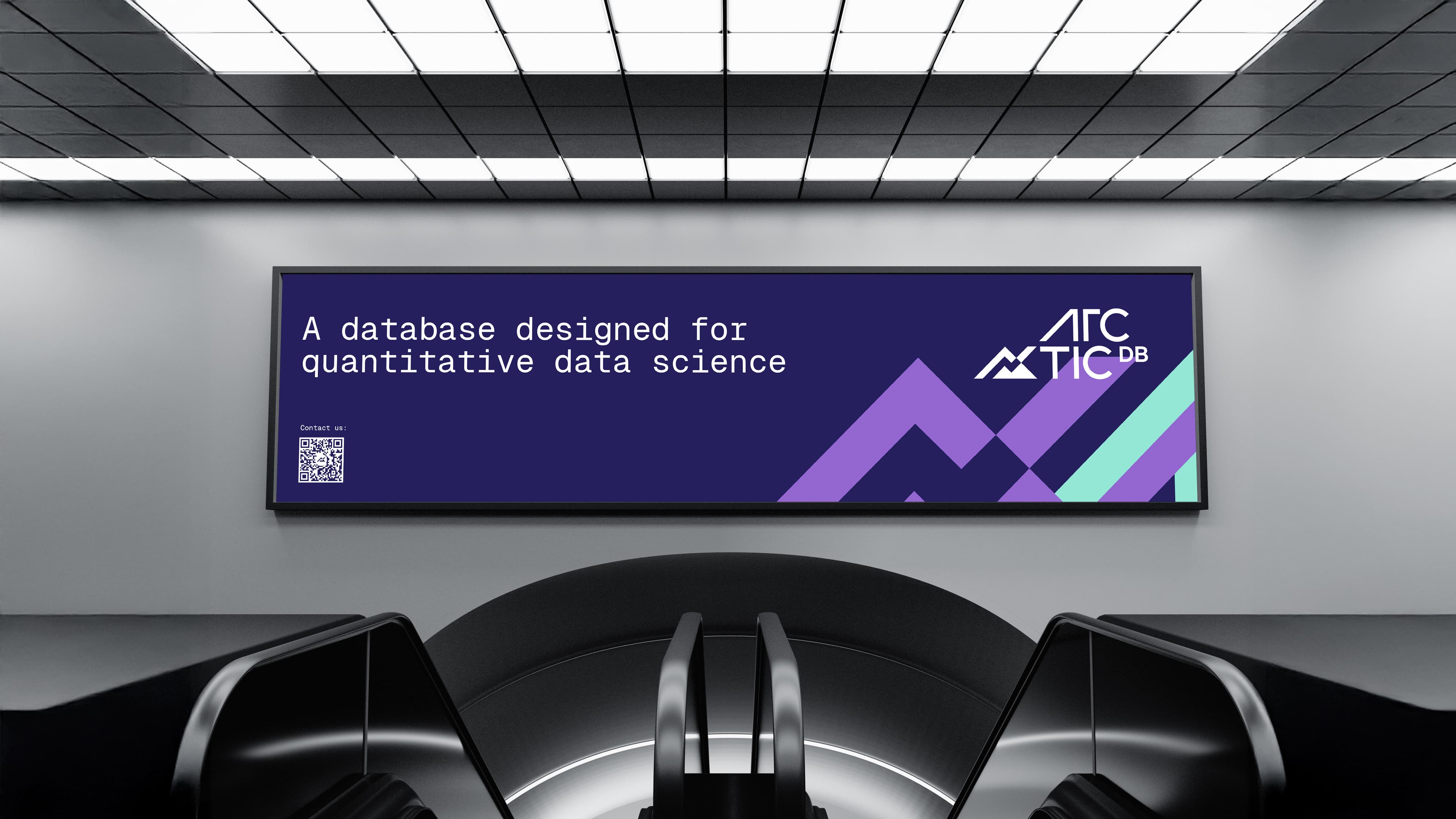
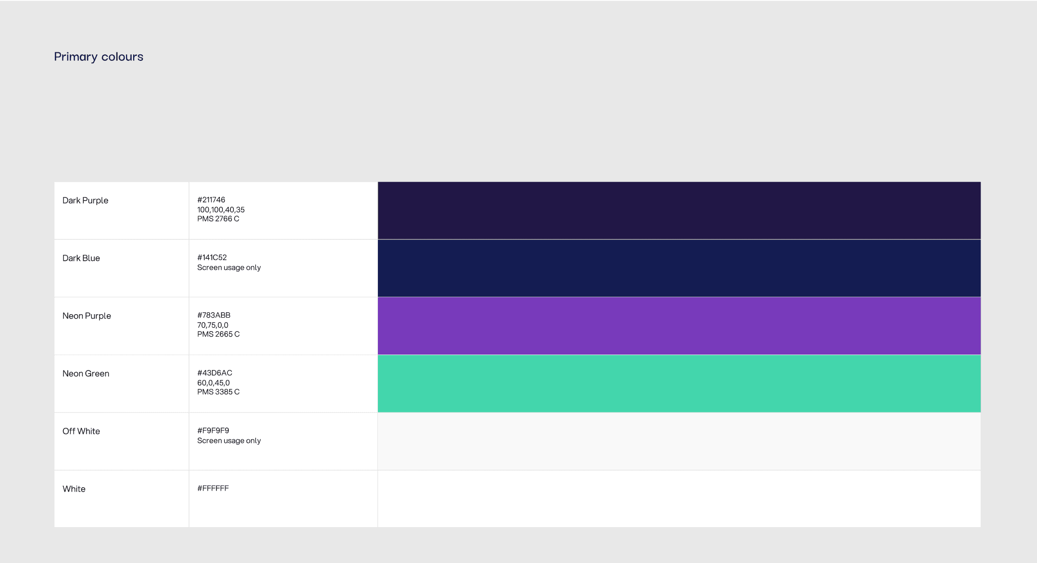
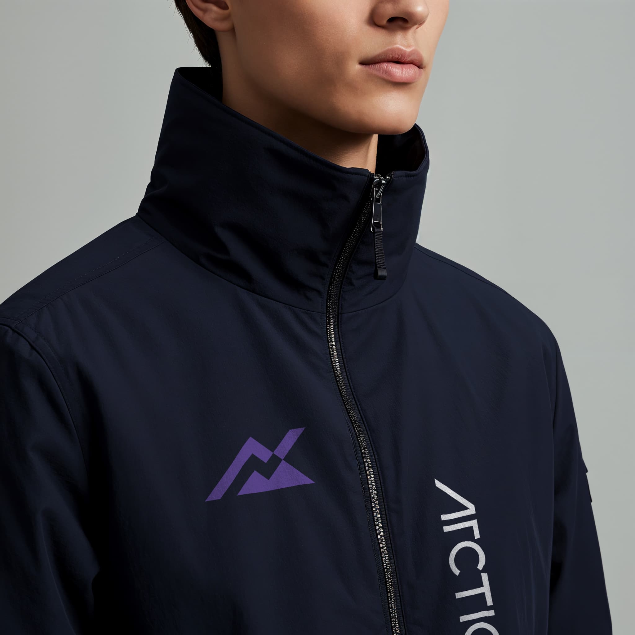
Each visual element of ArcticDB’s brand was rooted in their vision and the code that powers their technology. At its center is a modern arctic summit logomark infused with retro-futuristic style and an arctic colour palette, symbolizing growth, achievement and new possibilities.
Complemented by an ultra-modernist logotype, it reinforces ArcticDB’s forward-thinking ethos. The pixel block motifs subtly weave through the design - a core feature of the creative from the parent company Man Group - celebrating the foundational building blocks of computation, with some added structure from a distinctive typeface that speaks of the logical precision of data science.
As financial decisions aren’t just logical, but also emotional - we embellished ArcticDB’s connection with its audience through relatable stories, approachable language and aspirational imagery.
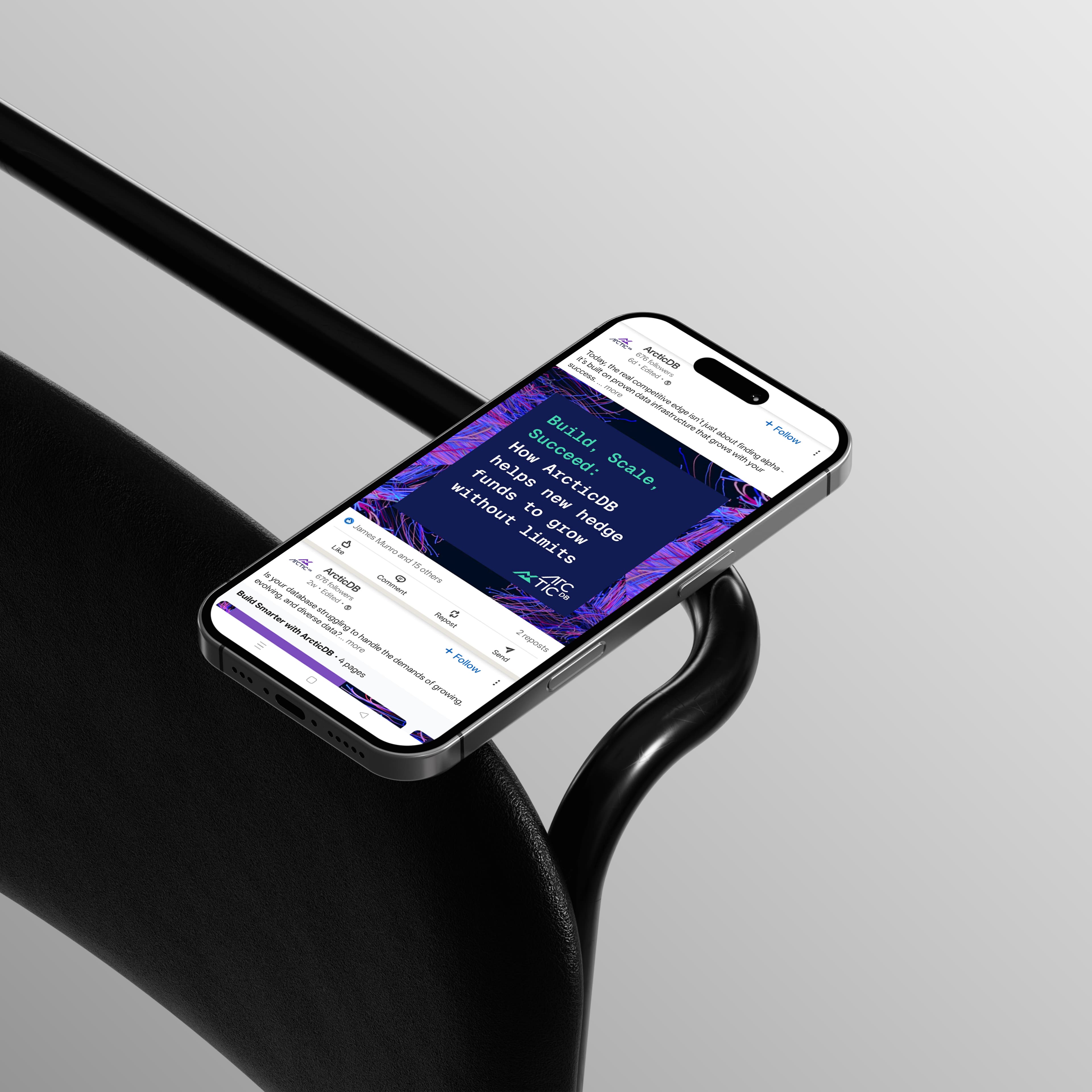
To bring it all to life, we completely reimagined and rebuilt ArcticDB’s website with impactful collateral and engaging video content forming an approachable, responsive and effective site that highlights the product’s transformative value.
ArcticDB’s identity is a cohesive, living system that captures the essence of their work: refined, purposeful, and built to reach new highs of innovation and discovery.
More than a marketing tool, their brand can be used as a strategic asset to build credibility in a market where customers can trust them with their financial decisions and security. With an application at every touchpoint, ArcticDB’s brand structure signals reliability, transparency and ethical practice in the crowded fintech market.