Art Rabbit
Turning art on its head
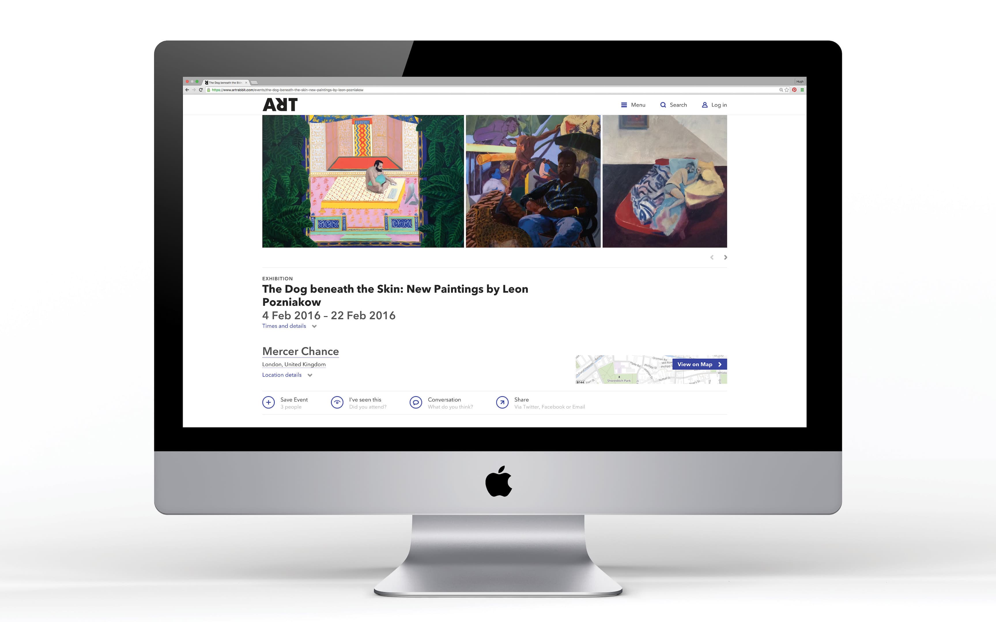
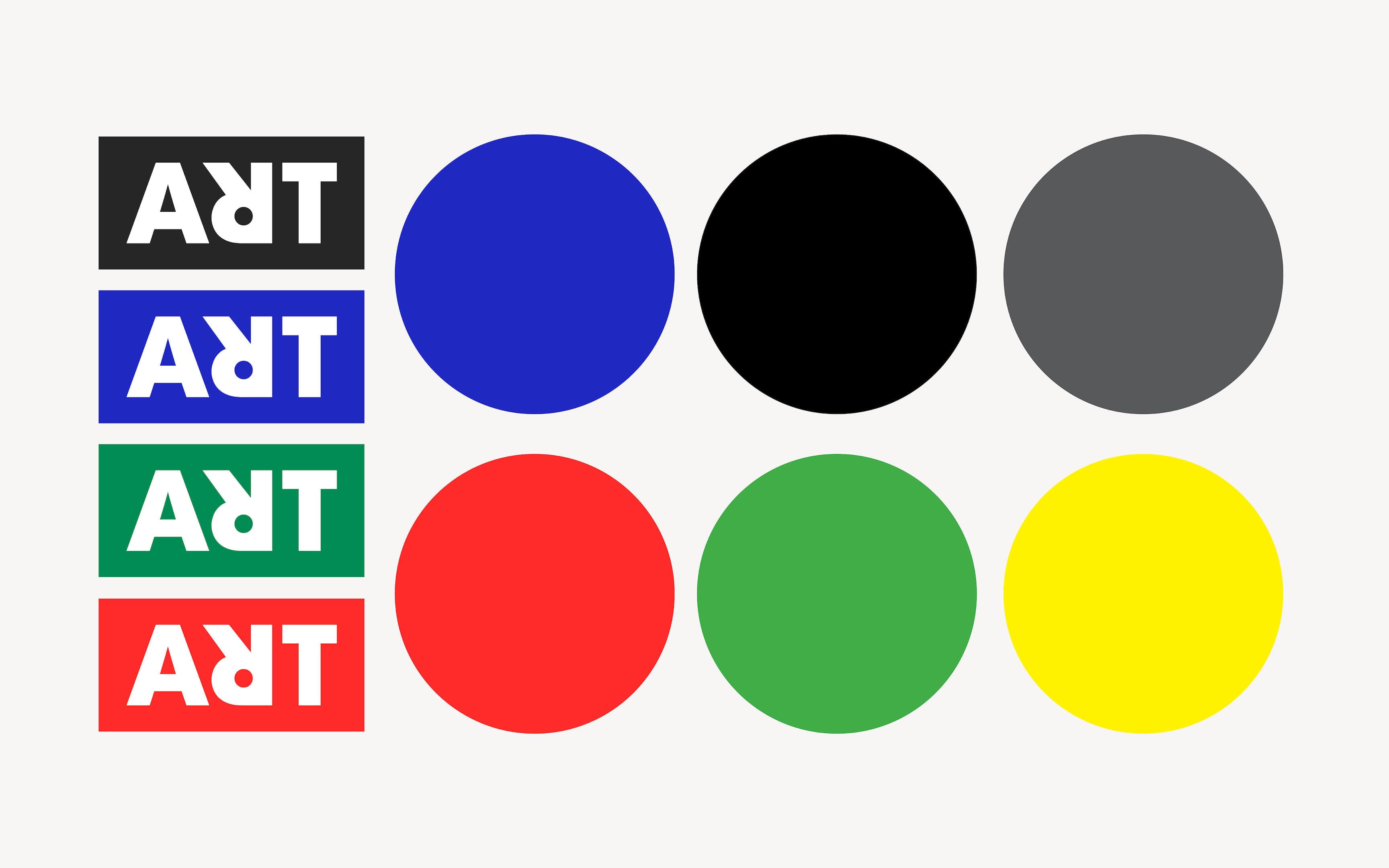
SE Studio created a new logo and brand language for ArtRabbit, the global digital platform and app for discovering contemporary art. The distinctive wordmark features a graphic 'rabbit-head' reversed R that visually signals the brand's promise of turning art on its head. A bold colour palette, typography system and editorial style scale cohesively across print, apparel, web and the ArtRabbit iOS app.
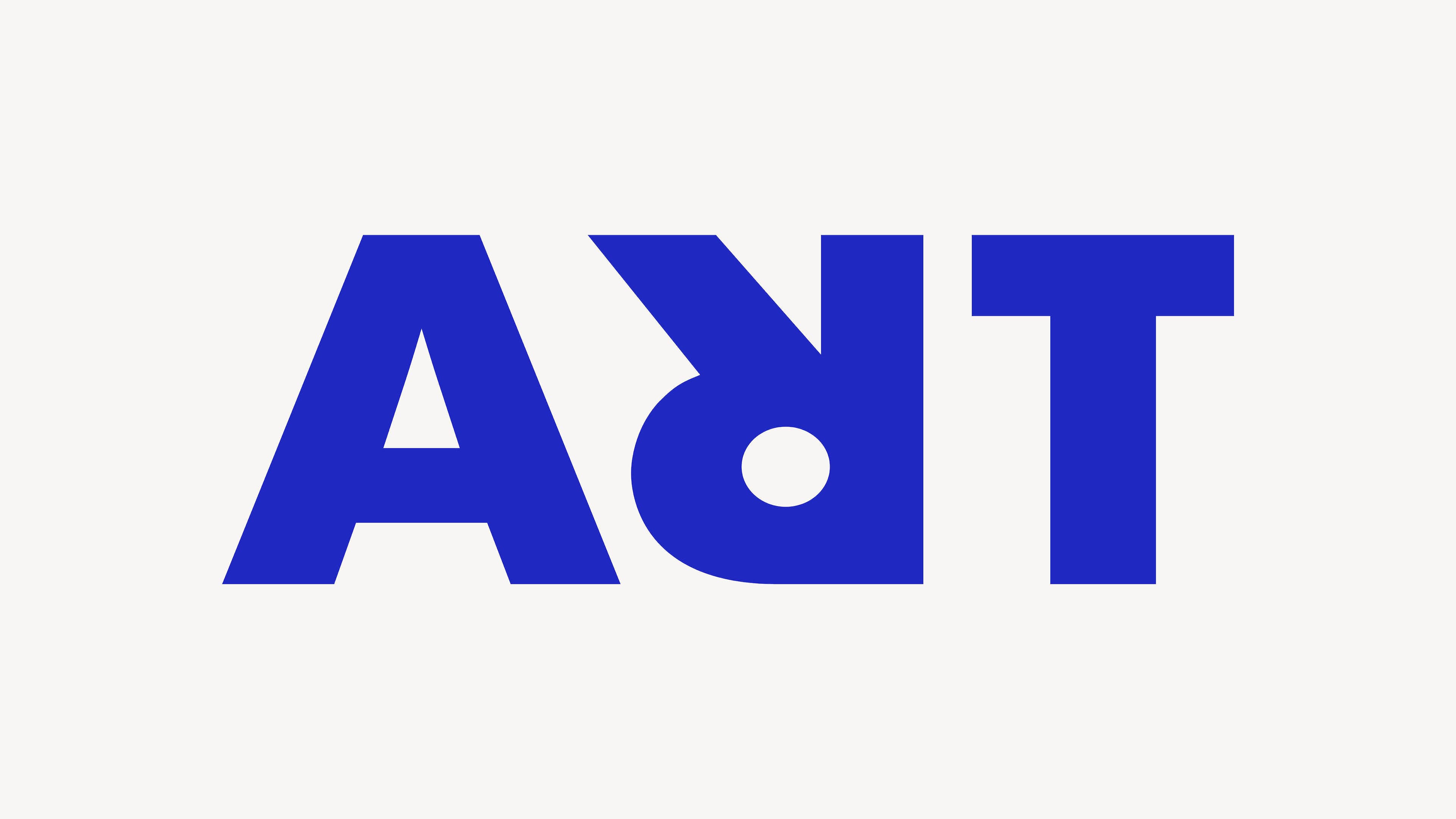
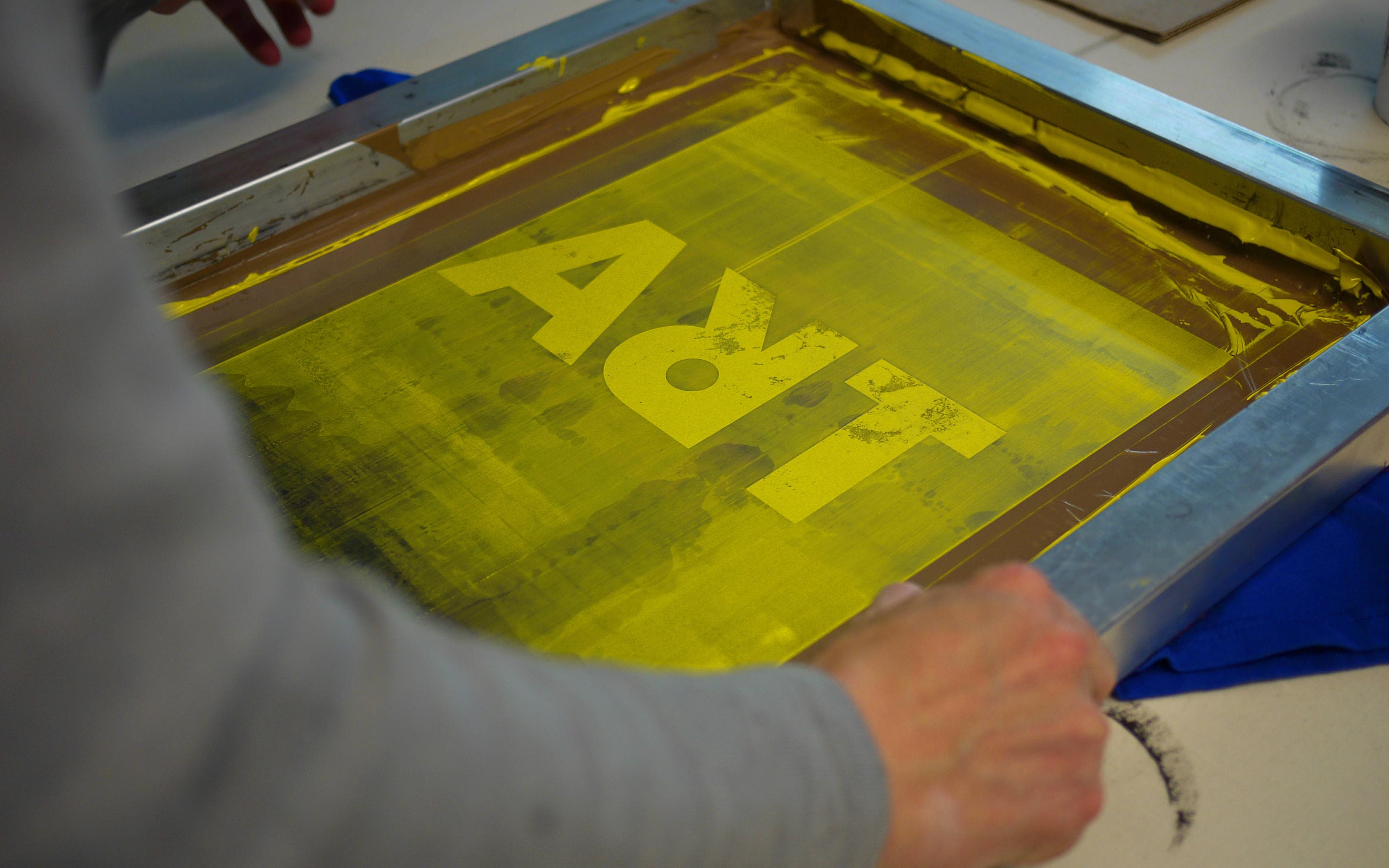
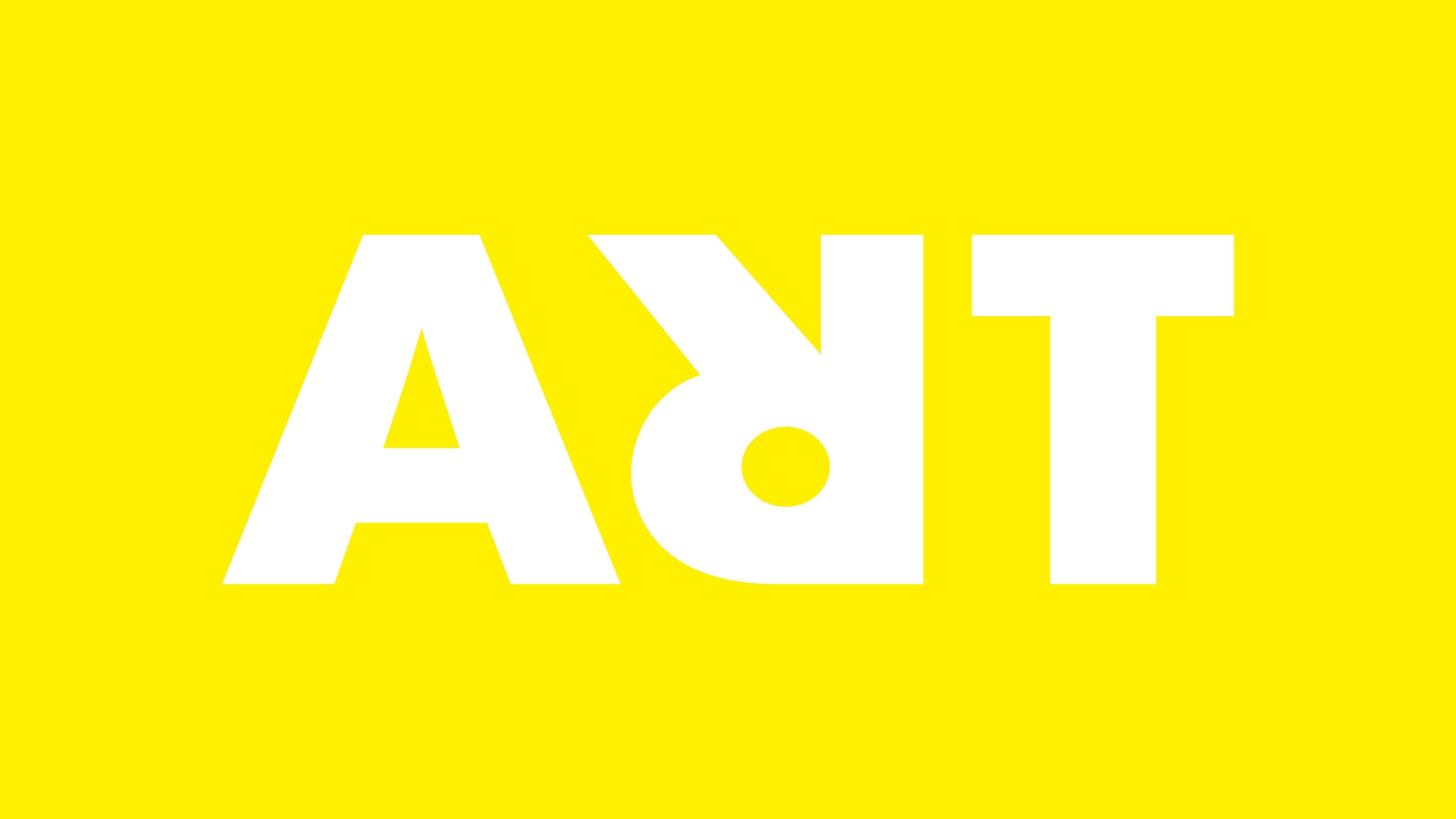
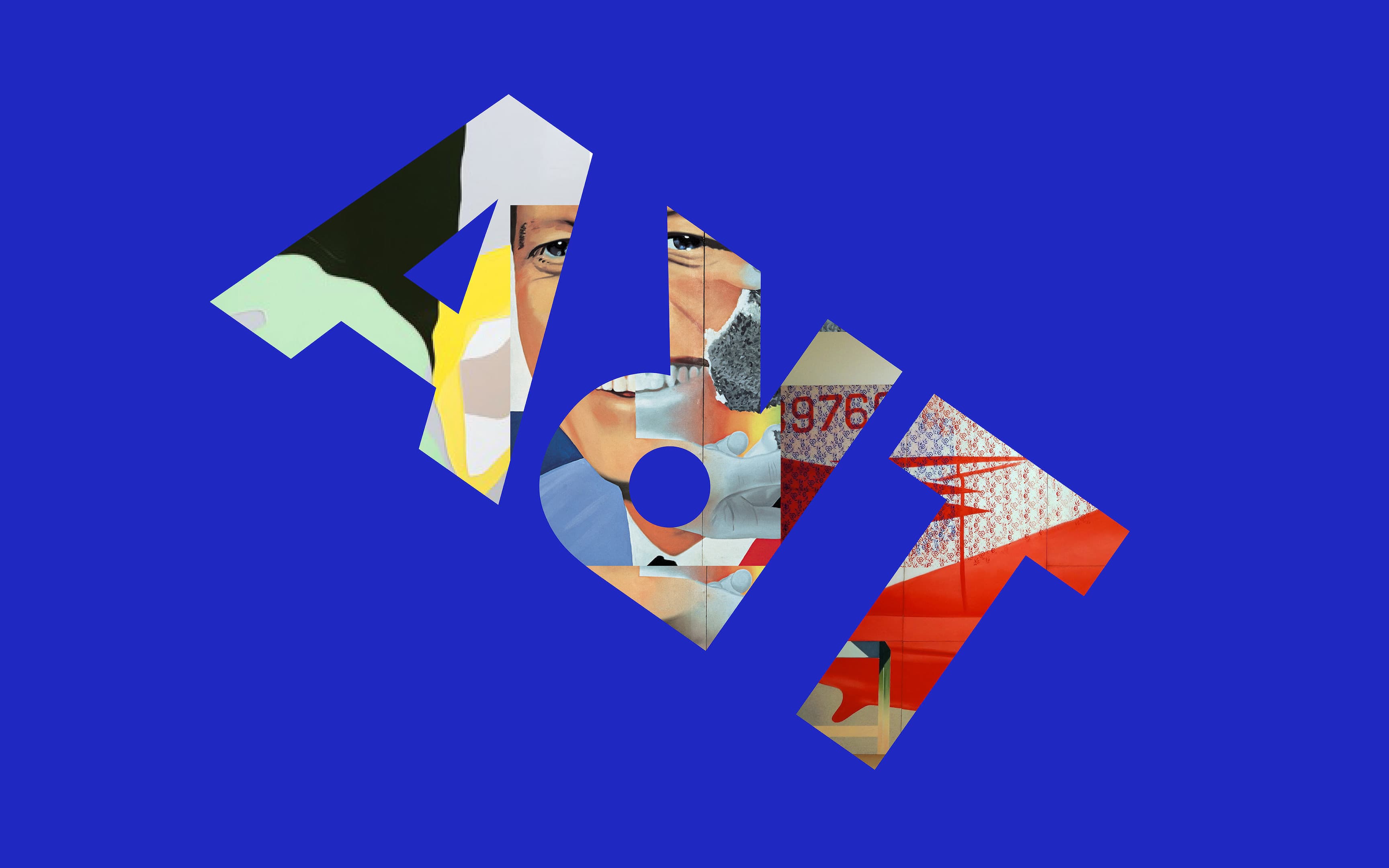
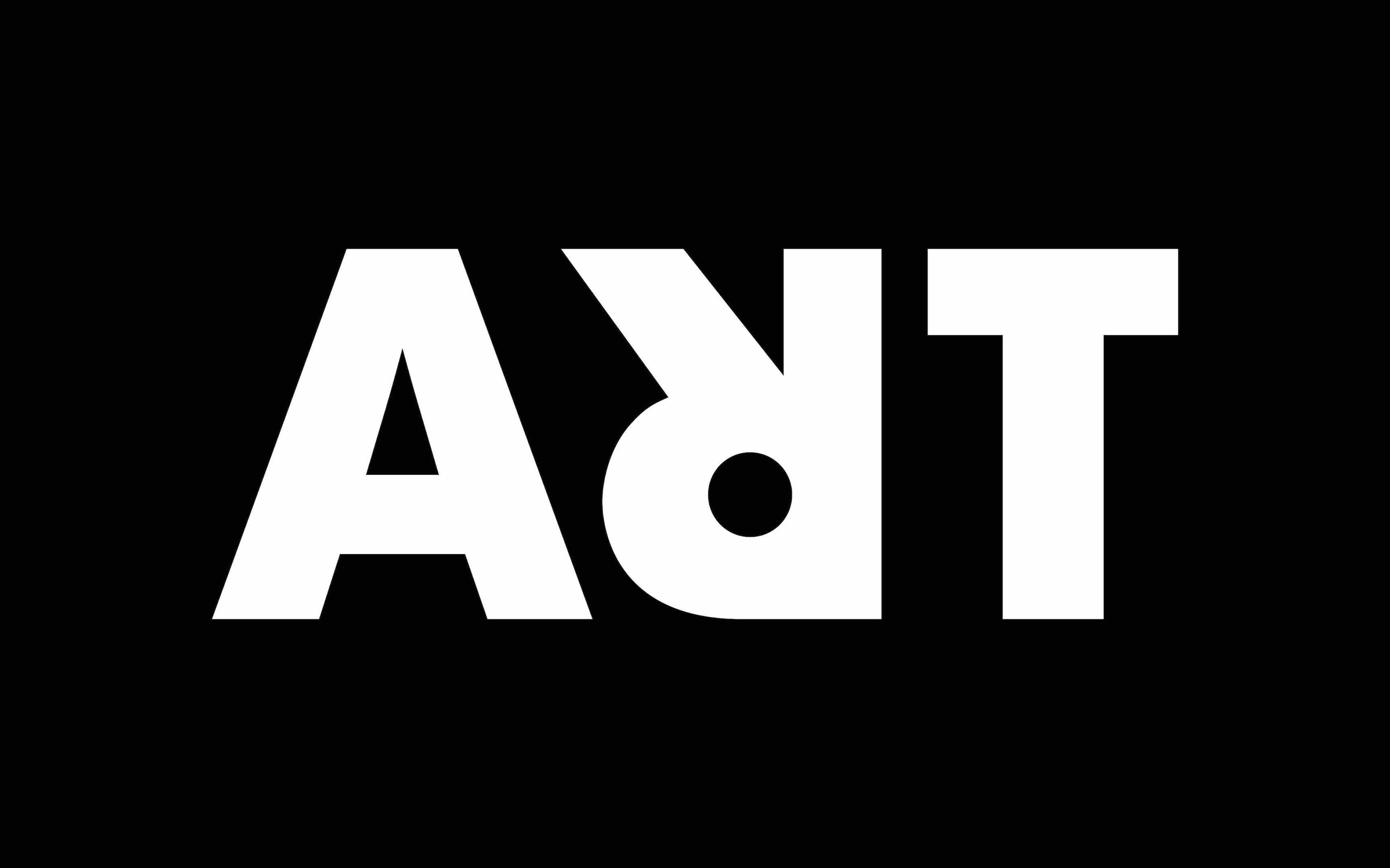
We created a bold, but simple logotype featuring a distinctive graphic rabbit head 'R', symbolising the idea of turning art on its head.
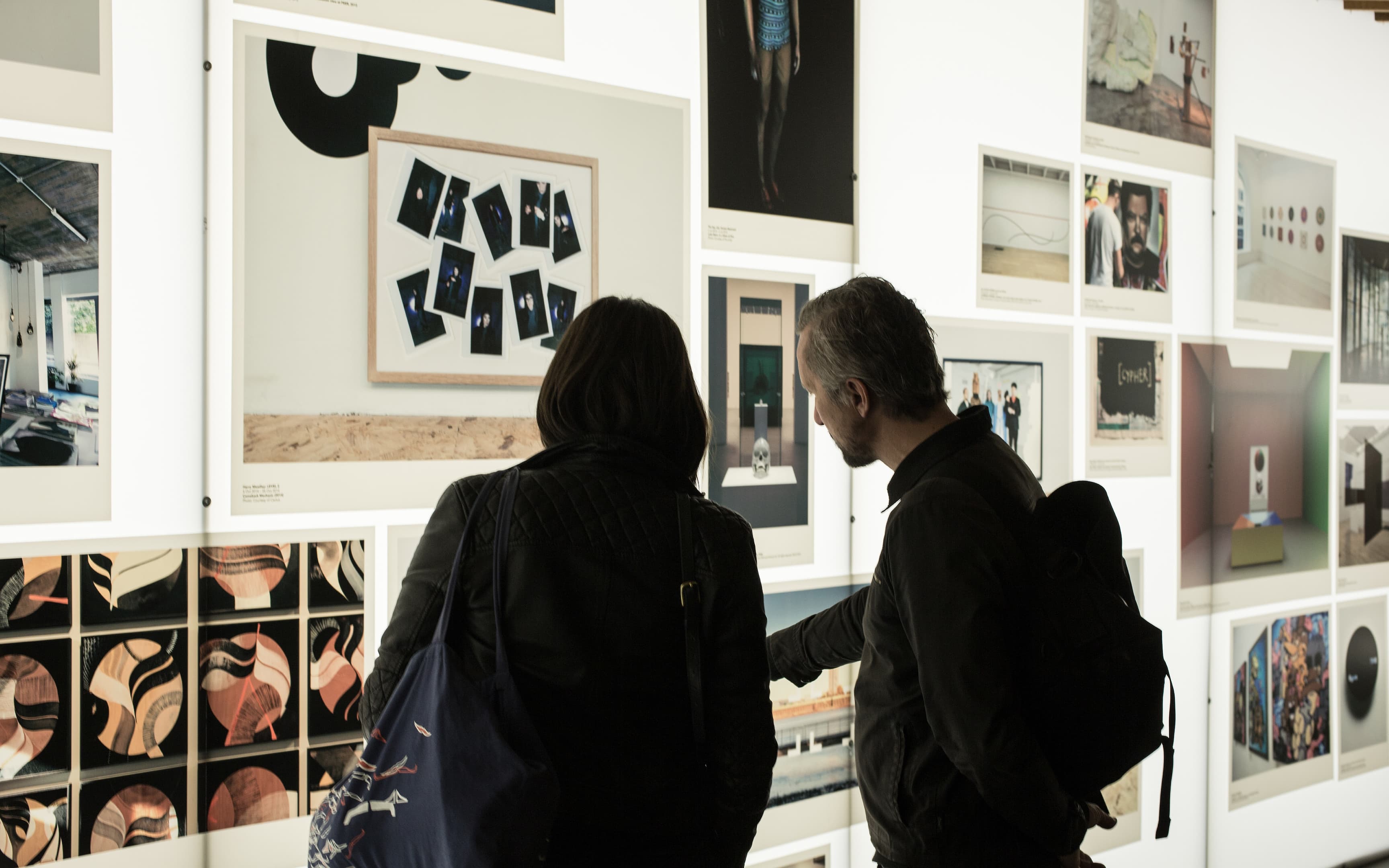
This innovative design element serves as a memorable visual marker but also encapsulates the brand's playful approach to art. A contemporary art scene that connects thousands of art spaces, exhibitions and events to artists, art professionals, collectors, students and art-interested people alike.
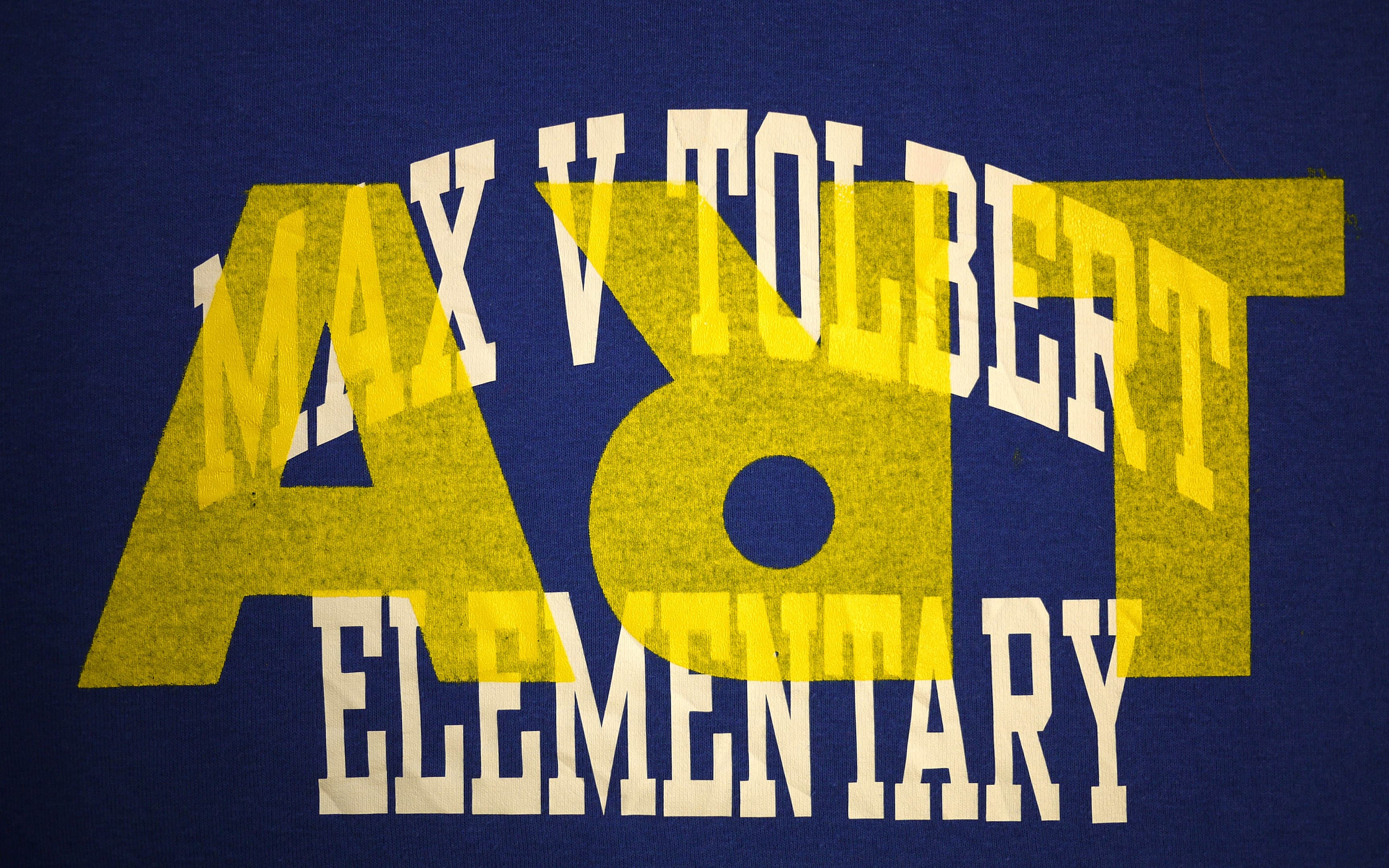
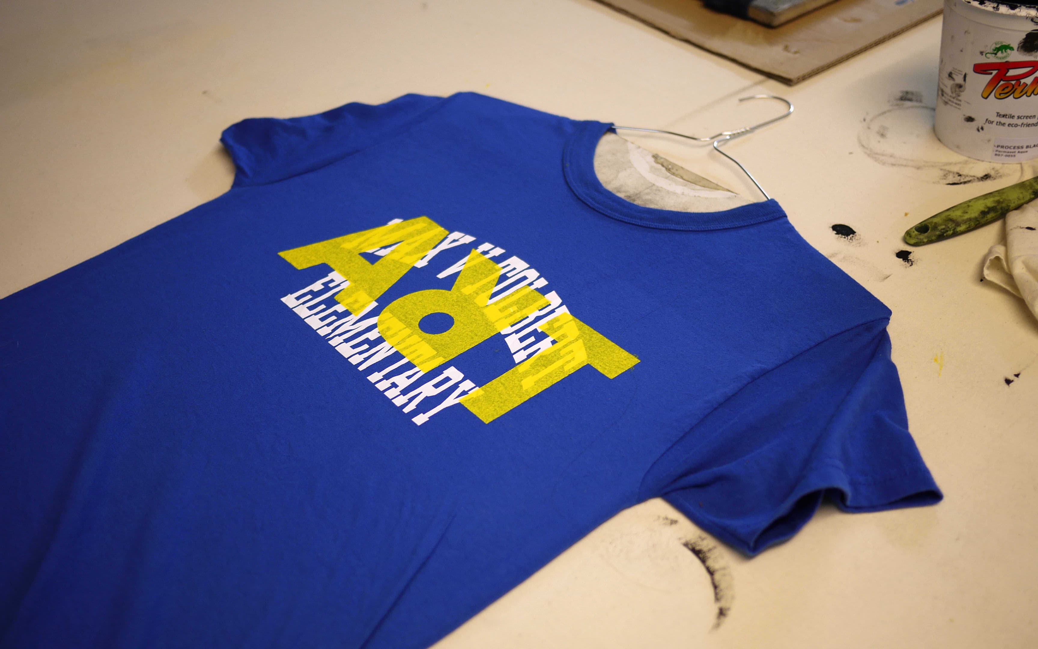
![Three graphic t-shirts hanging on a overhead cable indoors: a red shirt with "LRY" text, a black shirt with yellow graphic design, and a turquoise shirt with "ART" and "Ragfu[n]" text in white.](/_next/image/?url=https%3A%2F%2Fimages.ctfassets.net%2Fg0pw3n92bre6%2F5pFZlK4NpqsjJ0xCGYO18I%2Fbc4f6cc9180019ba8f01467f2a404c7e%2FAR-ARTshirts.jpg&w=3840&q=75)
The ‘R’ reflects the brand’s commitment to creativity and originality.
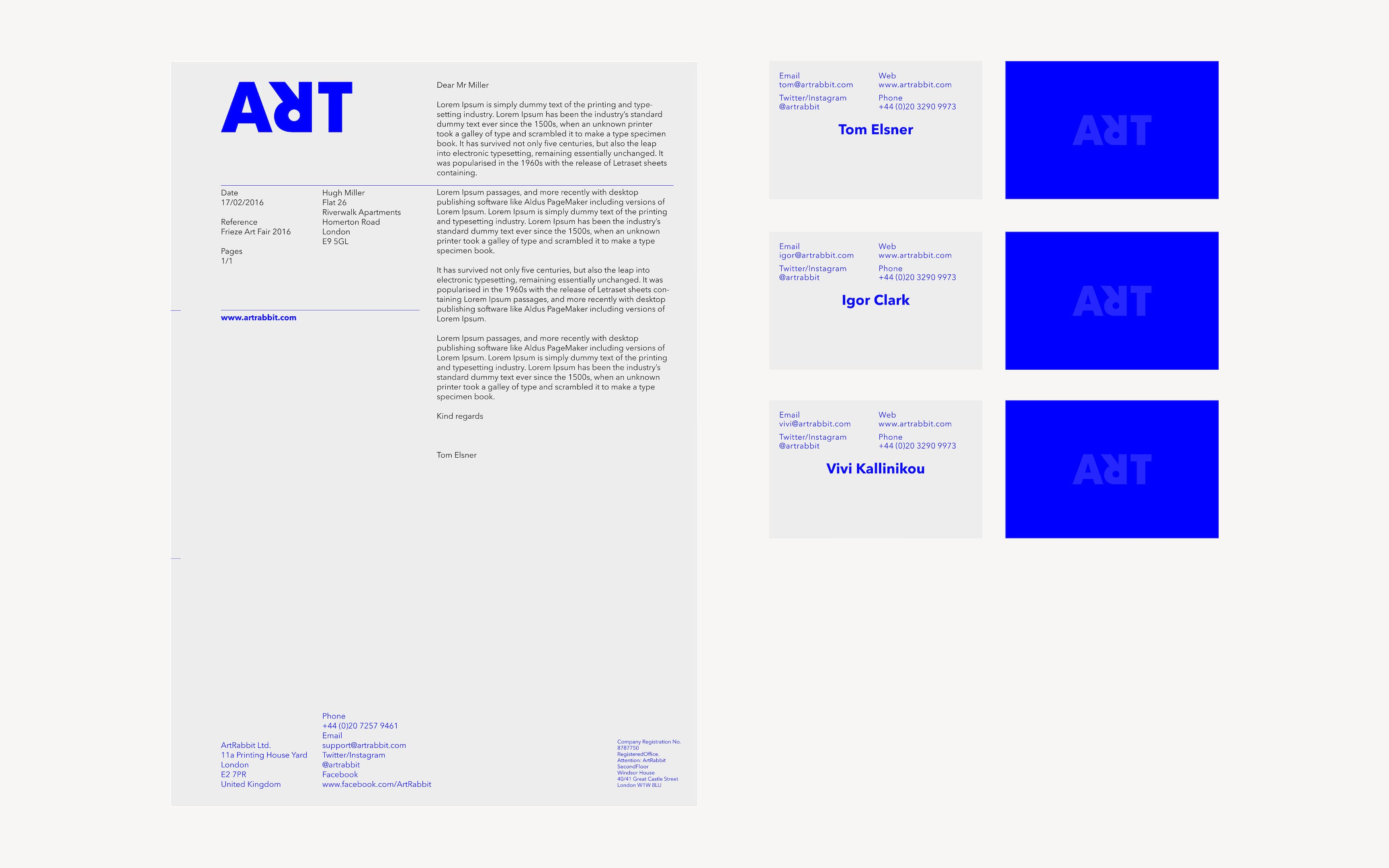
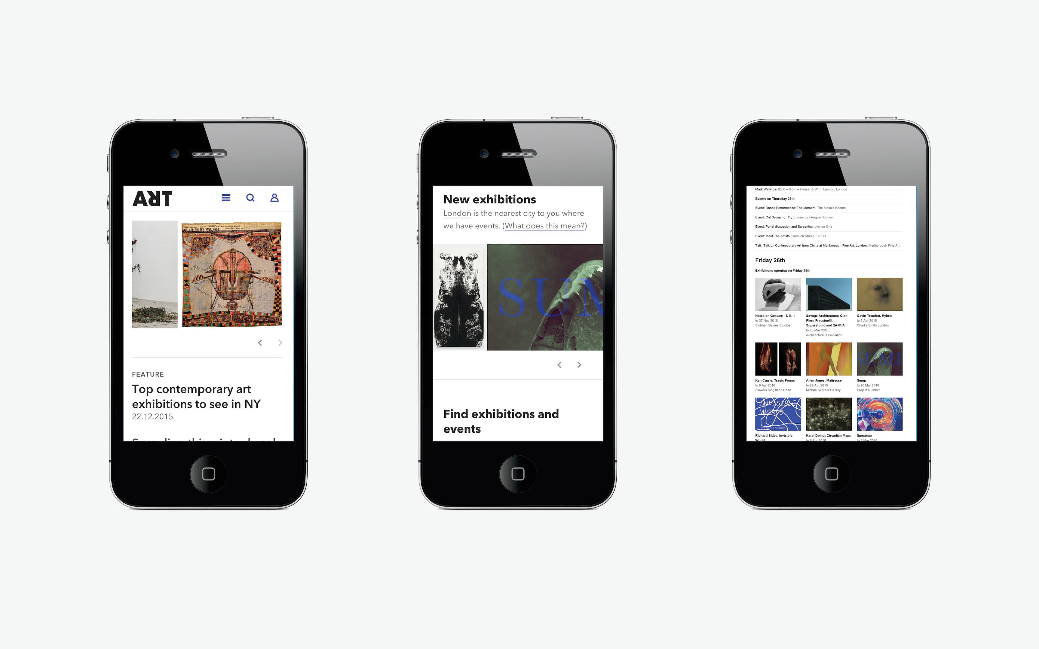
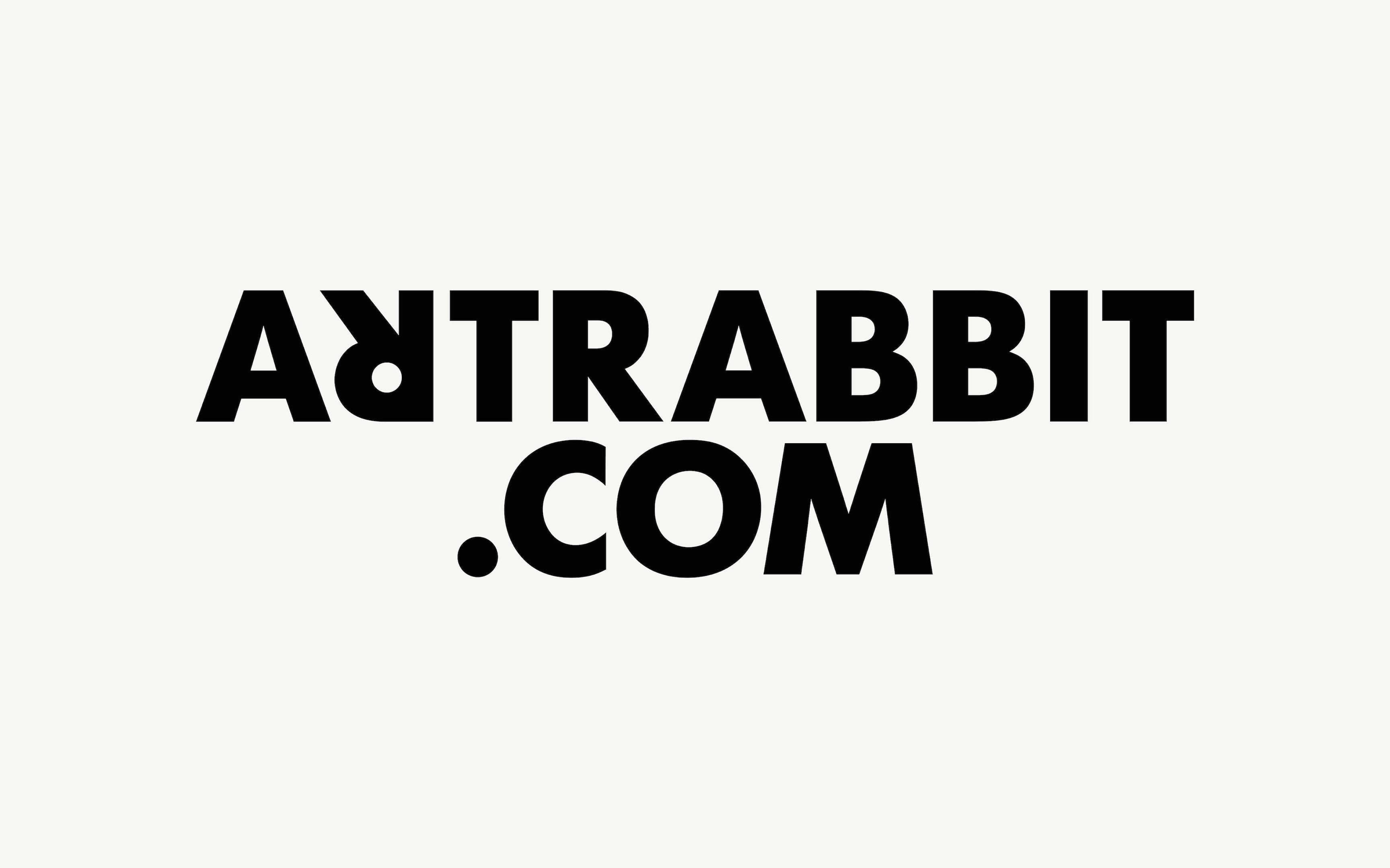
This logotype, combined with a cohesive colour palette and typography, ensures a consistent brand identity and language, from print materials to digital media.