Moriarty
Putting the art in party
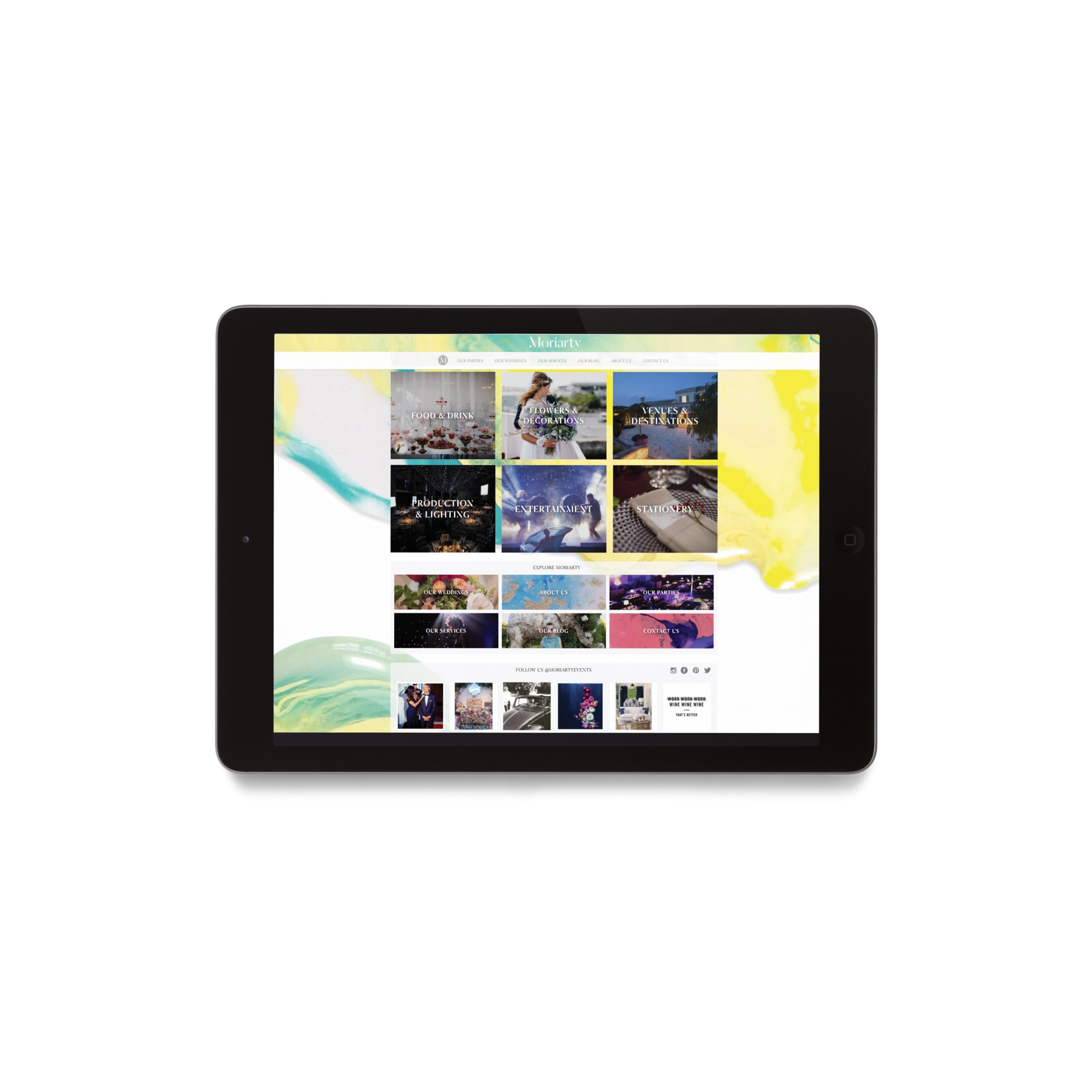
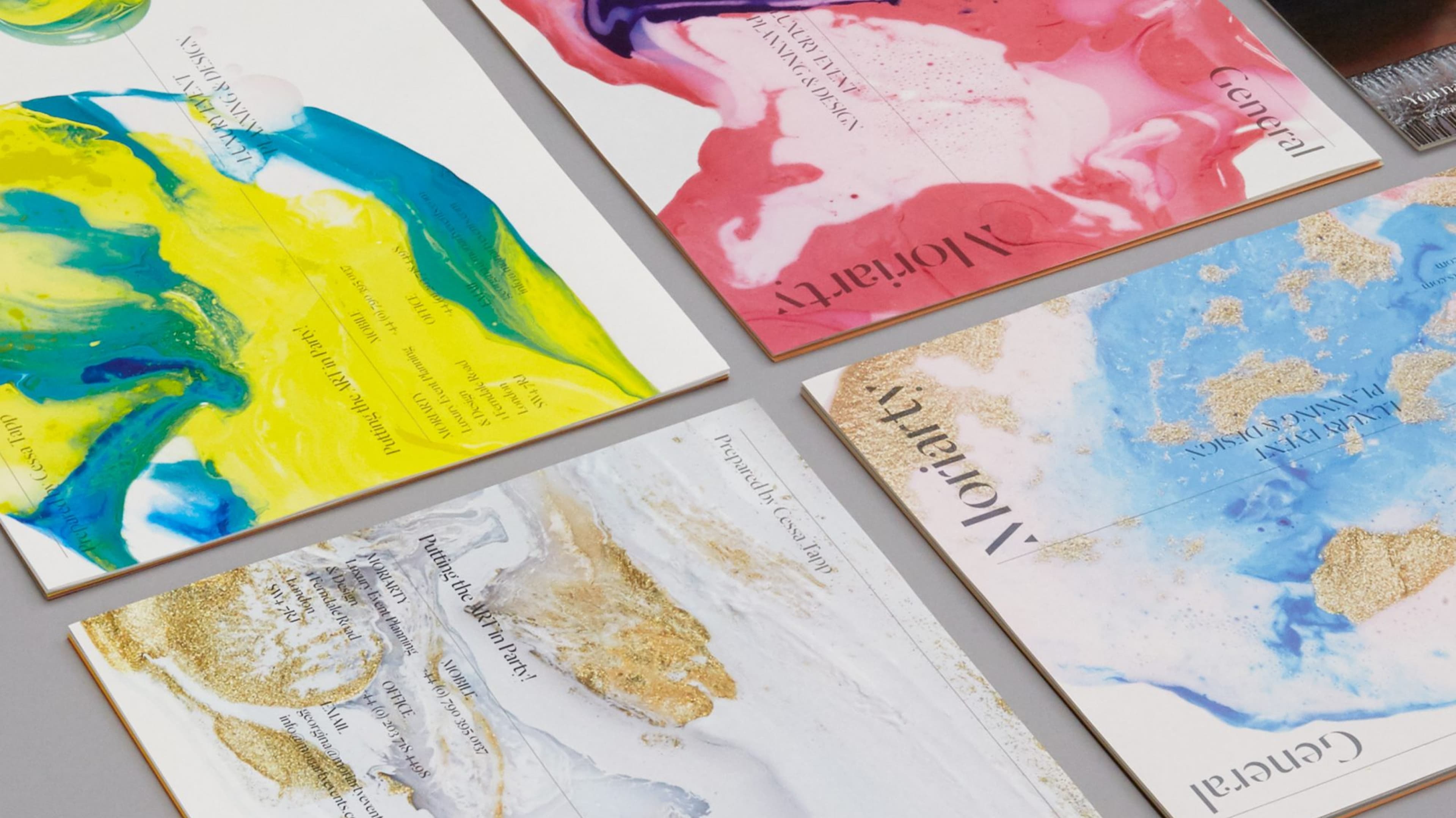
Prior to their launch, SE Studio created the brand identity, stationery, pitch documents and website for Moriarty, a London-based luxury event-planning specialist. The identity is a language of contrasts: vibrant abstract marbled illustrations sit against cool grey and navy palettes, anchored by a structured stencil logo. The result evokes celebration, spontaneity and the idea that curating great events is itself an art form.
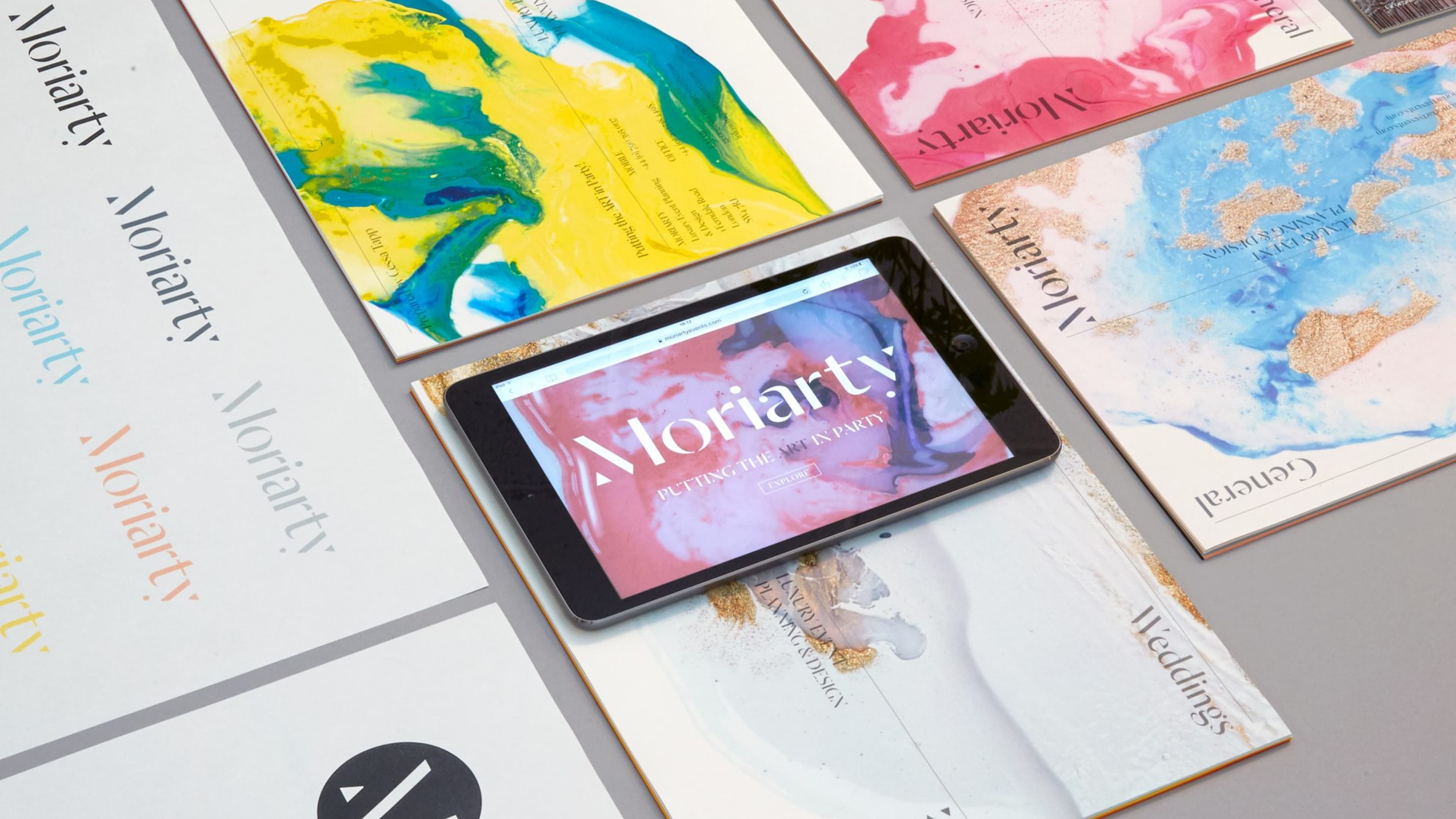
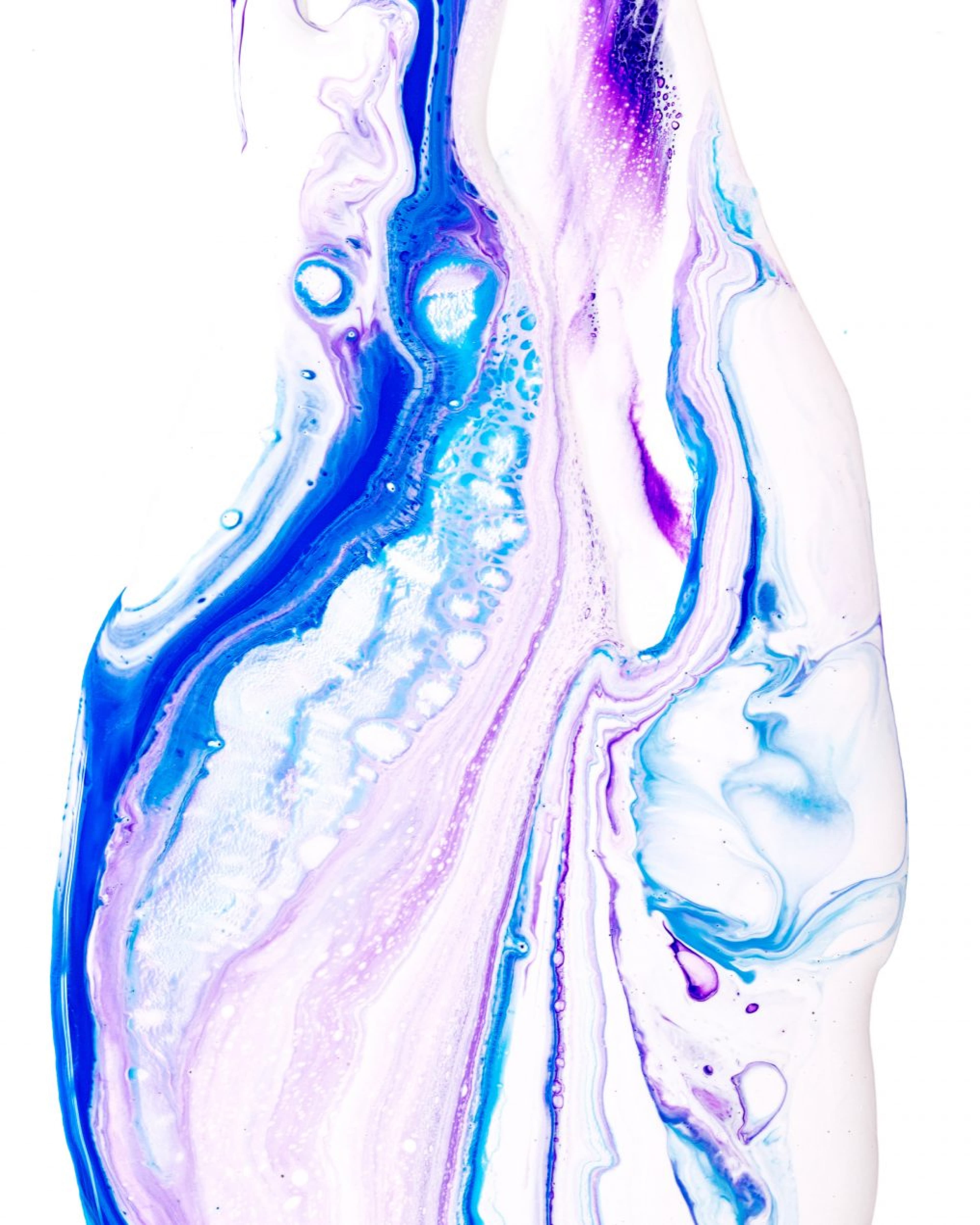
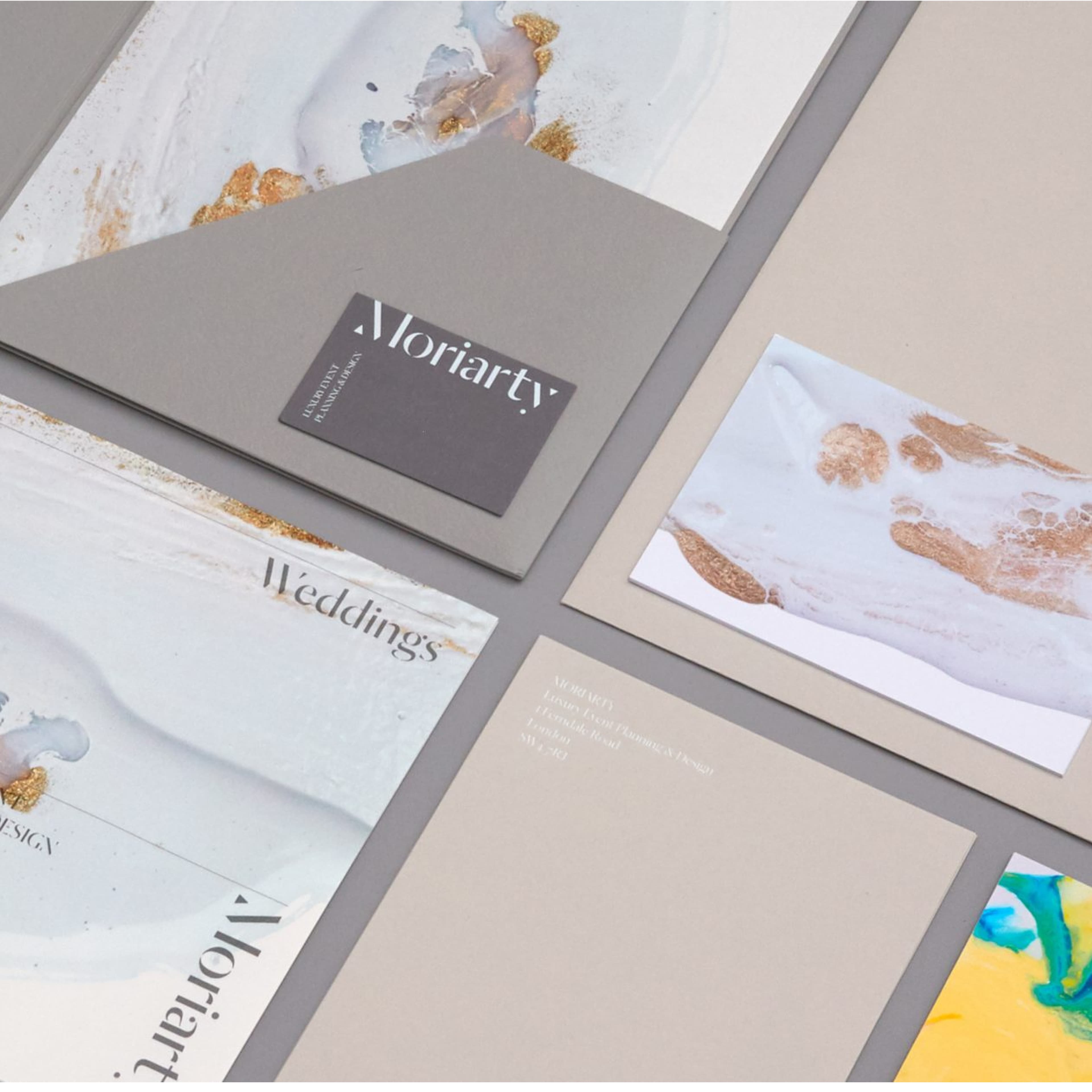
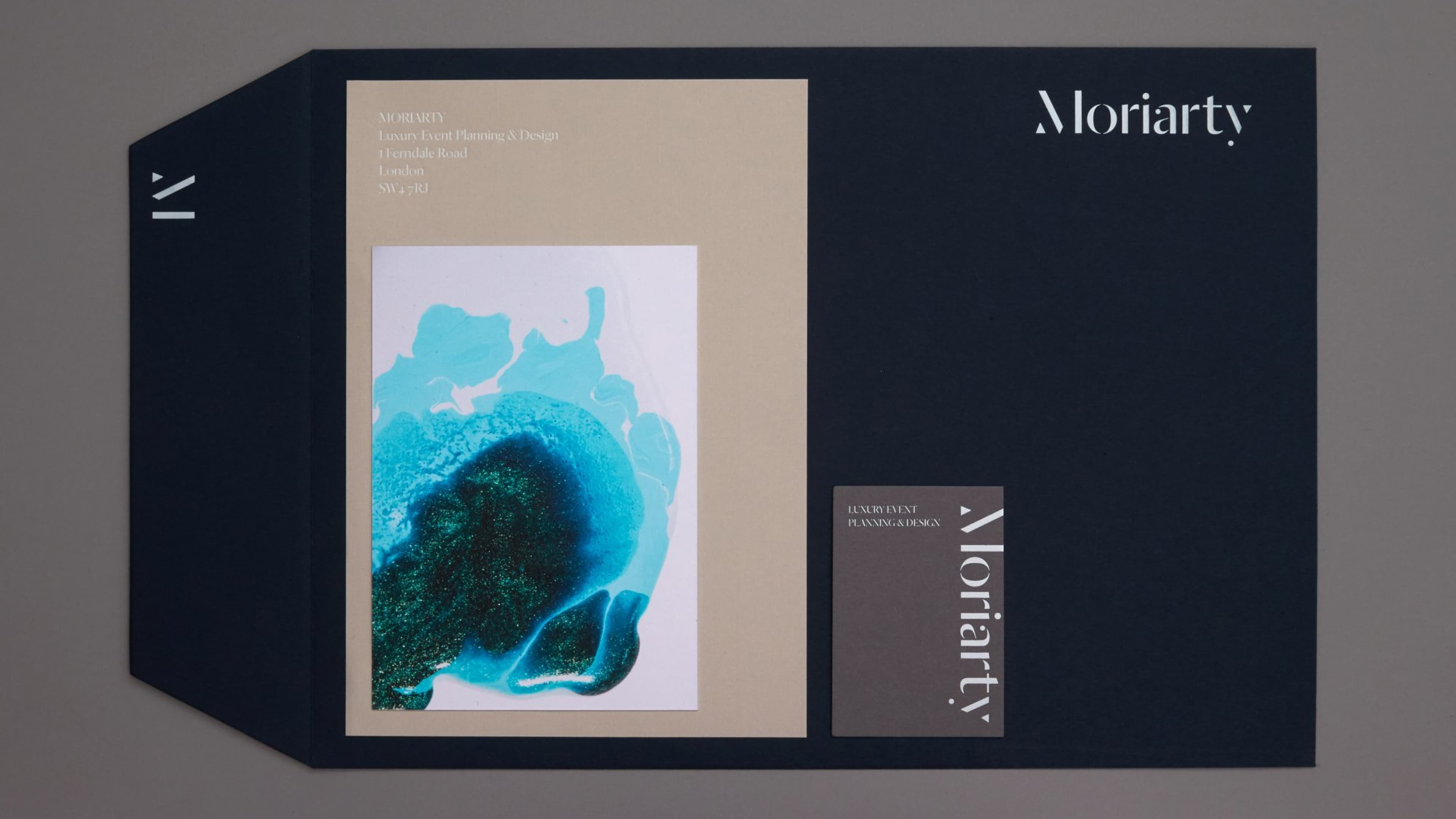
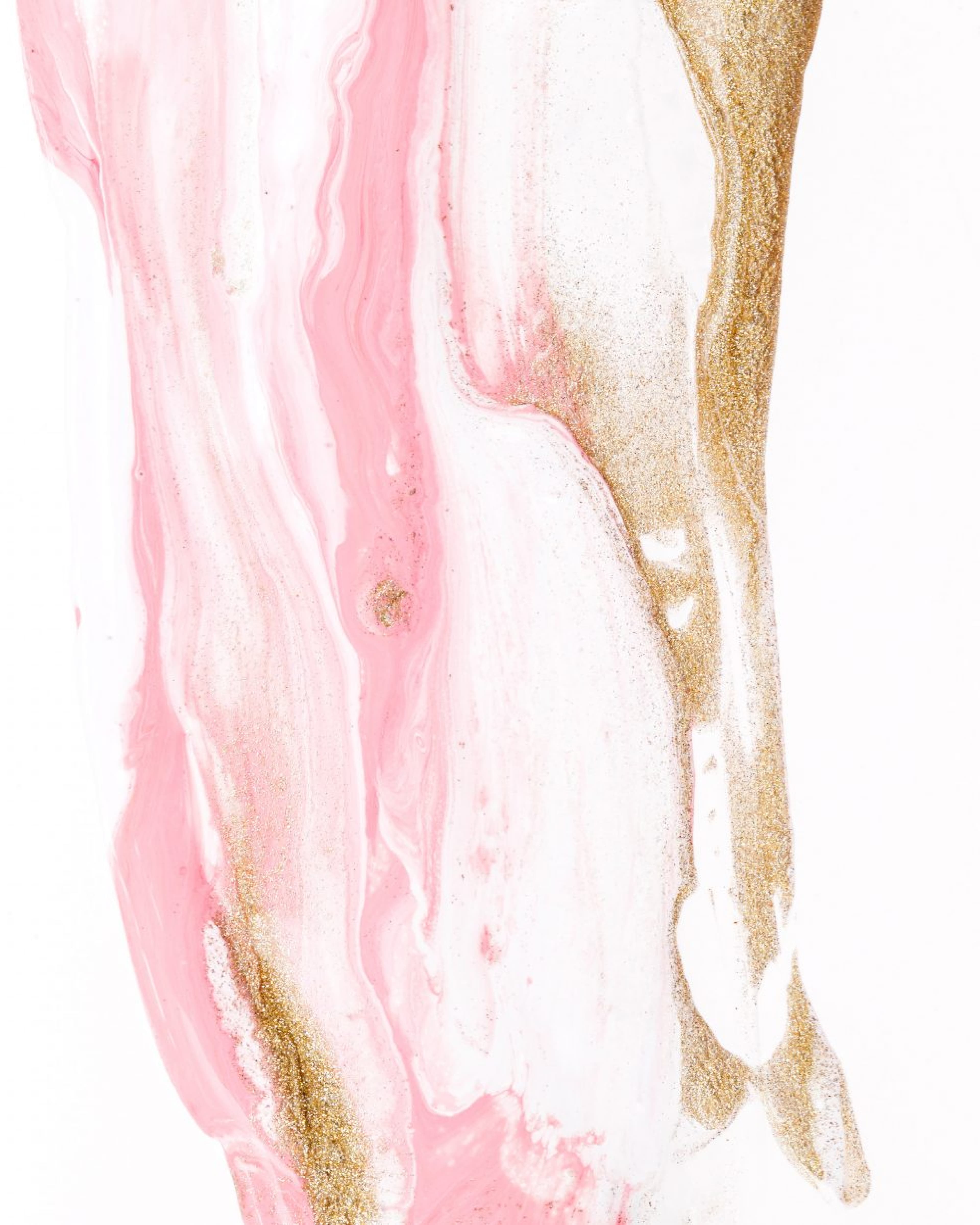
Working across the Moriarty website, stationery and pitch documents, we focused on developing a language of contrasts. Inspired by the spontaneity and energy of the party scene and exploring the notion that curating great events is an art form, we crafted a series of abstract illustrations to be used as key brand assets.
Vibrant colour and moving form sit amongst cool grey tones and navy blue materials. The structured stencil logo and typography give form, character and an order of information.
The new brand identity evokes celebration, fun and spontaneity - like a good party.
From typography used in business cards to playful imagery and logo variations, each brand illustration reflects a breezy, easy-to-approach tone and image.