Poncle
Games for fun
Entertainment and games studio Poncle reached unexpected success within gaming communities worldwide when they delivered the simple, yet very joyful gaming experience, Vampire Slayer, to the market. To reflect their expansive growth, Poncle tasked SE Studio to evolve and reimagine their brand logo and business assets. Our approach was driven by a rebrand that aligns with the client’s future goals, secures customer loyalty and positions Poncle in the market as a respectful and enjoyable player platform.
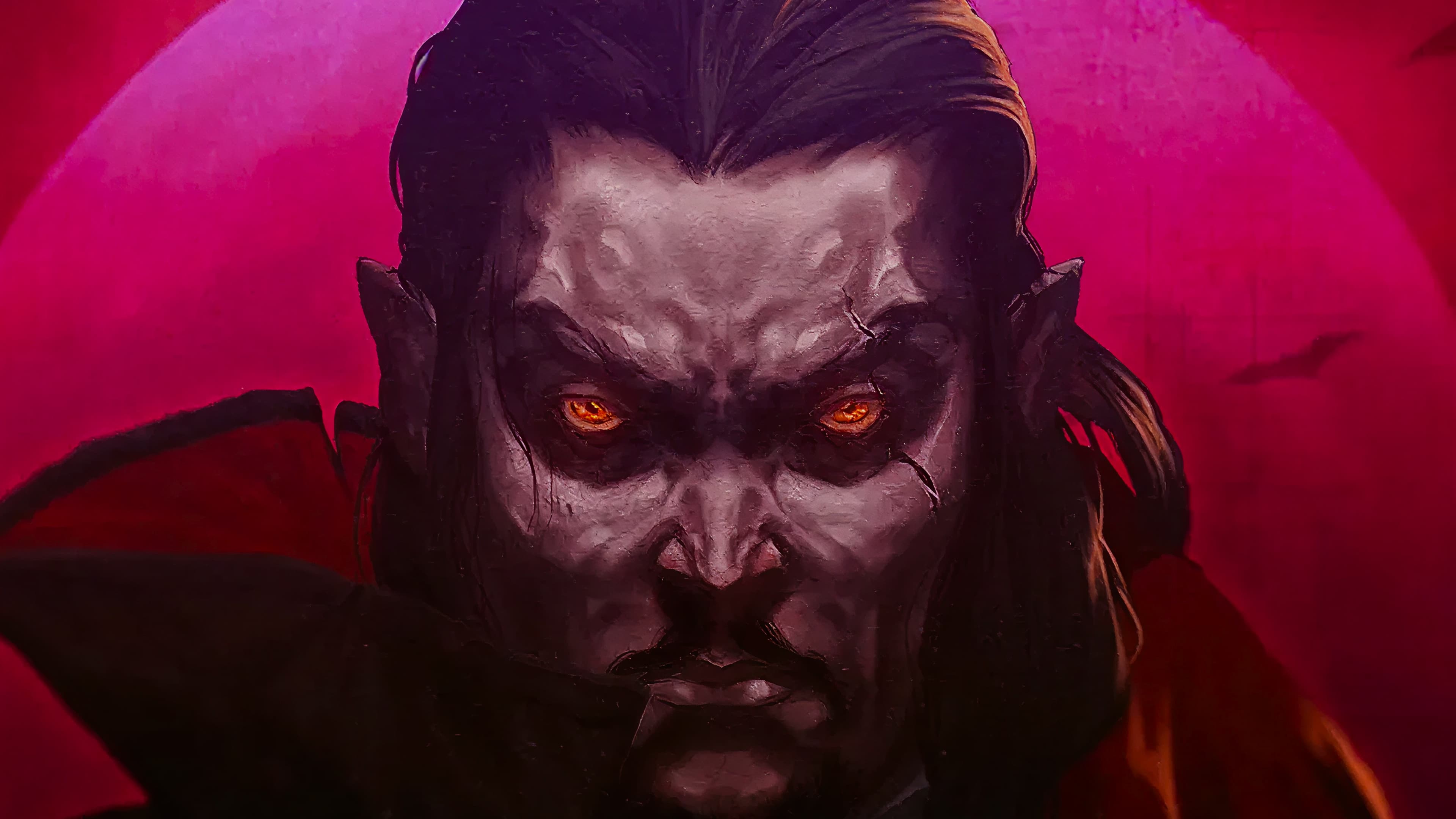
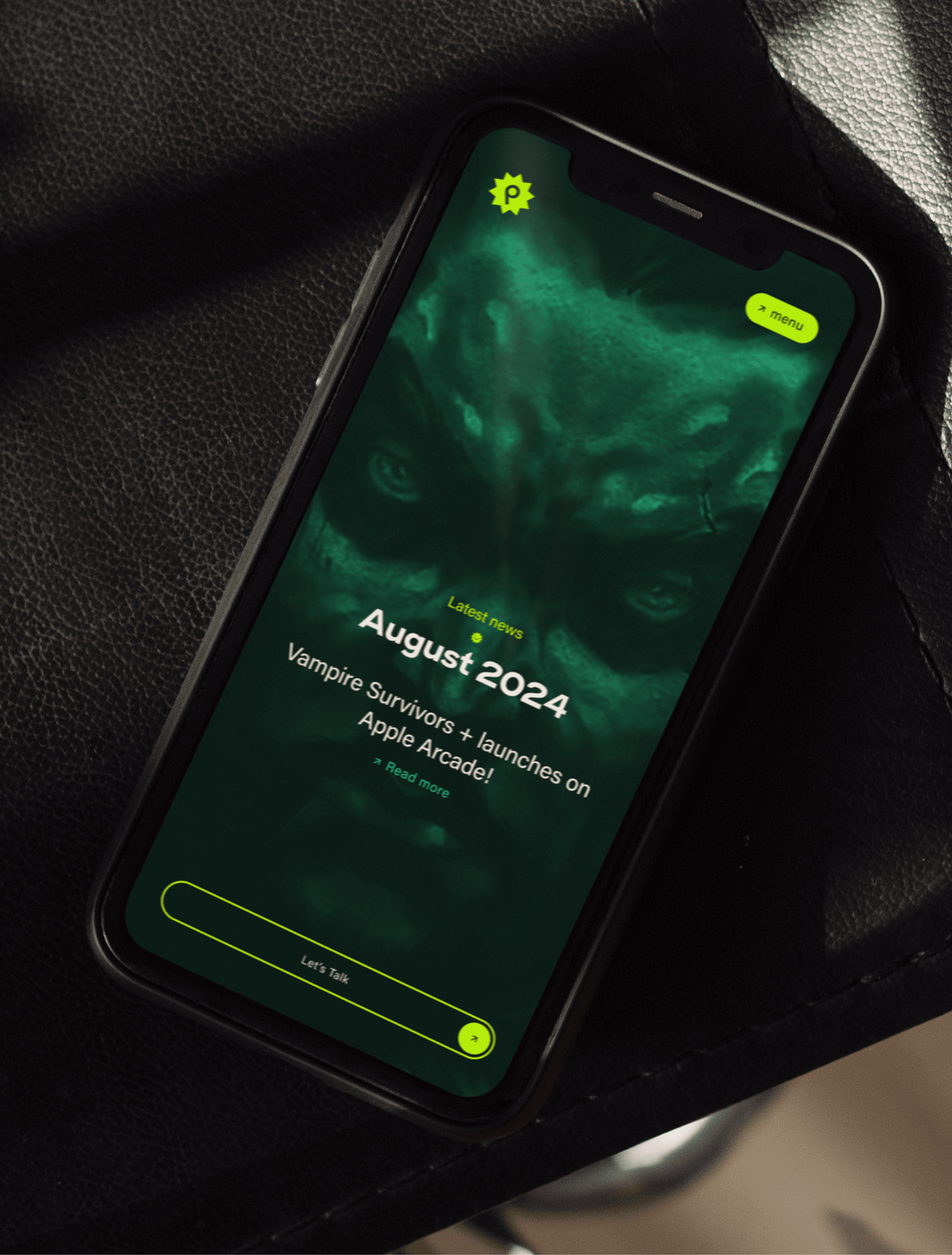
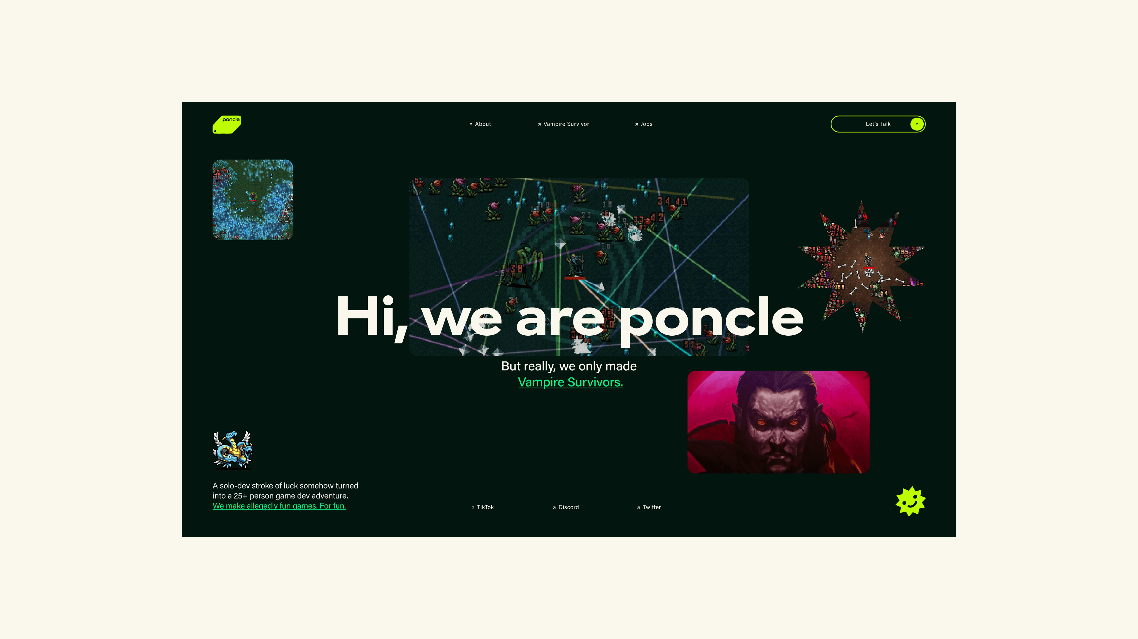
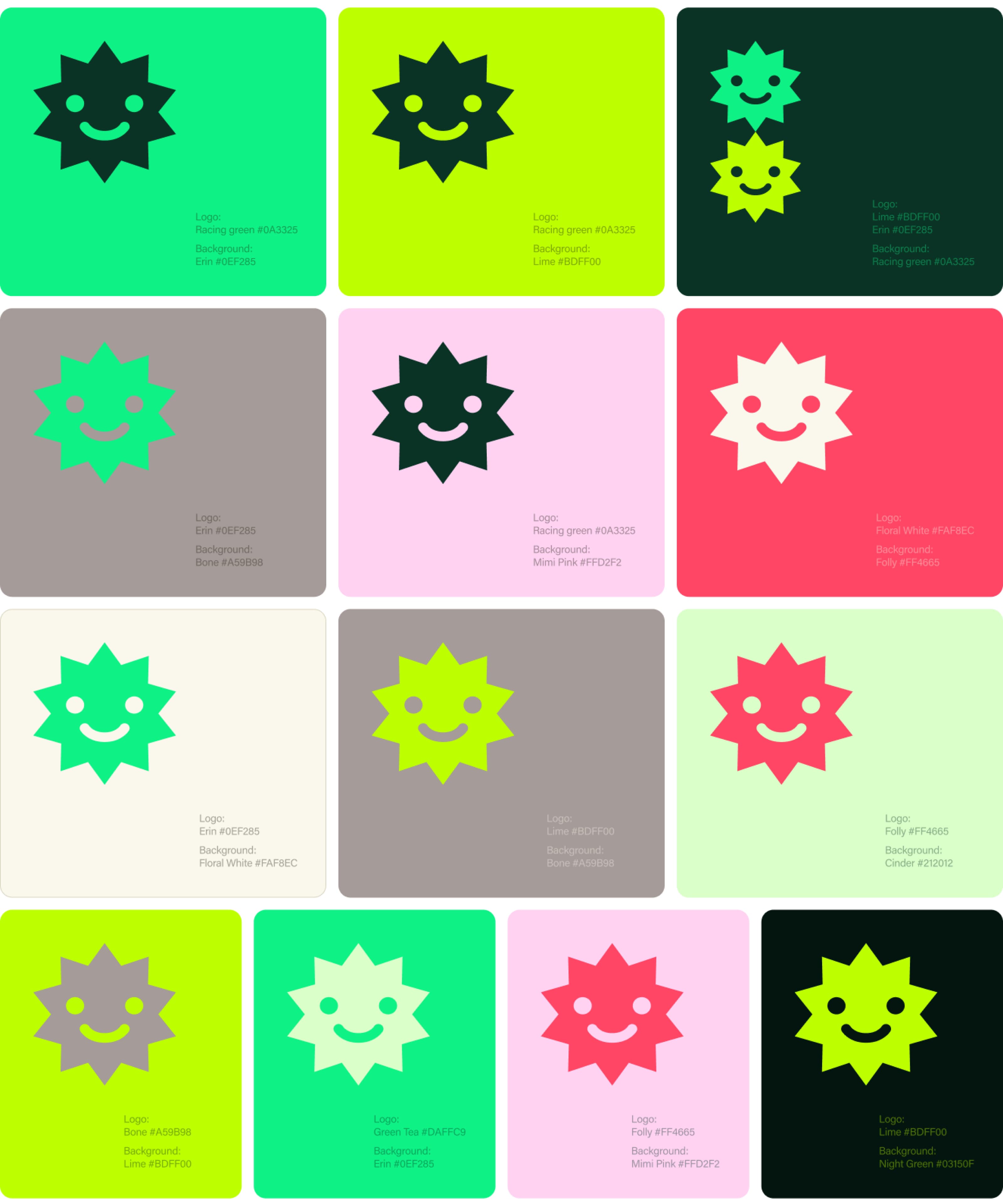
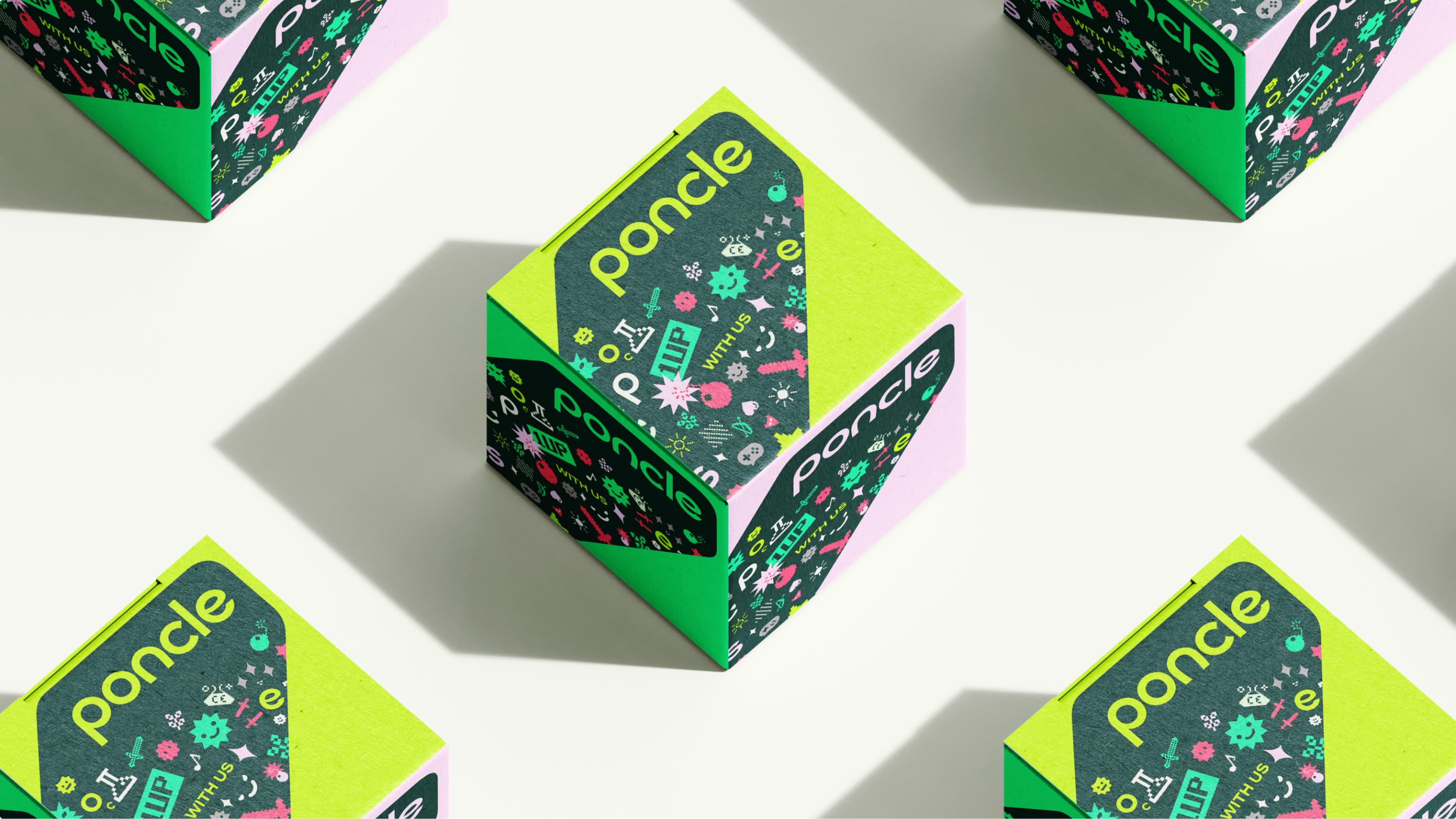
To signify the approachability and lightness of their brand, bold typefaces, icons and avatars sit as a set of core elements to include in any communication ventures.
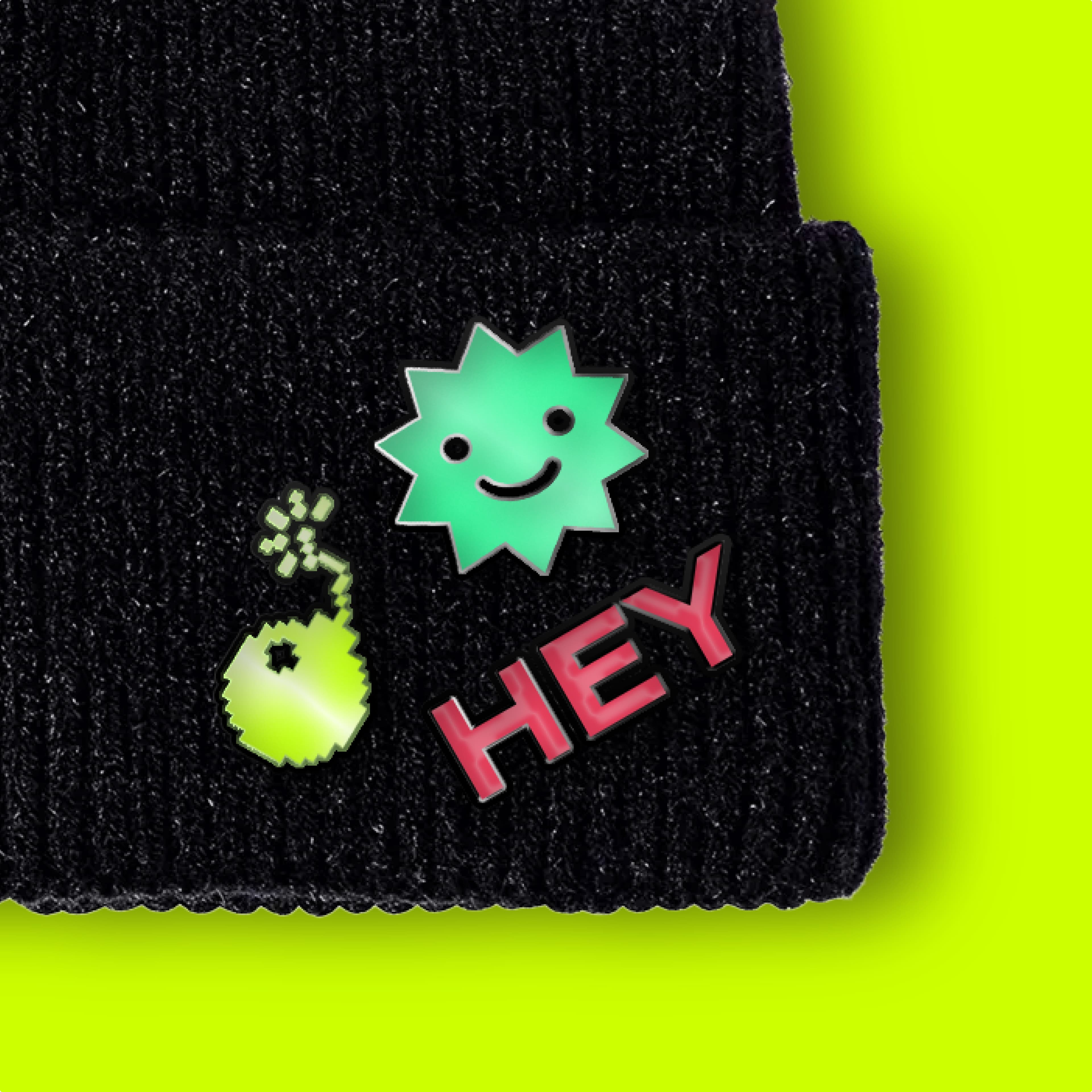
The stickers are a neat way to express creativity and form connections in the gaming world, while the bright and lively colours reflect excitement and liveliness, conveying the brands’ fun and youthful spirit. An approach that ensures that both experienced gamers and newcomers alike find the brand inclusive and appealing.

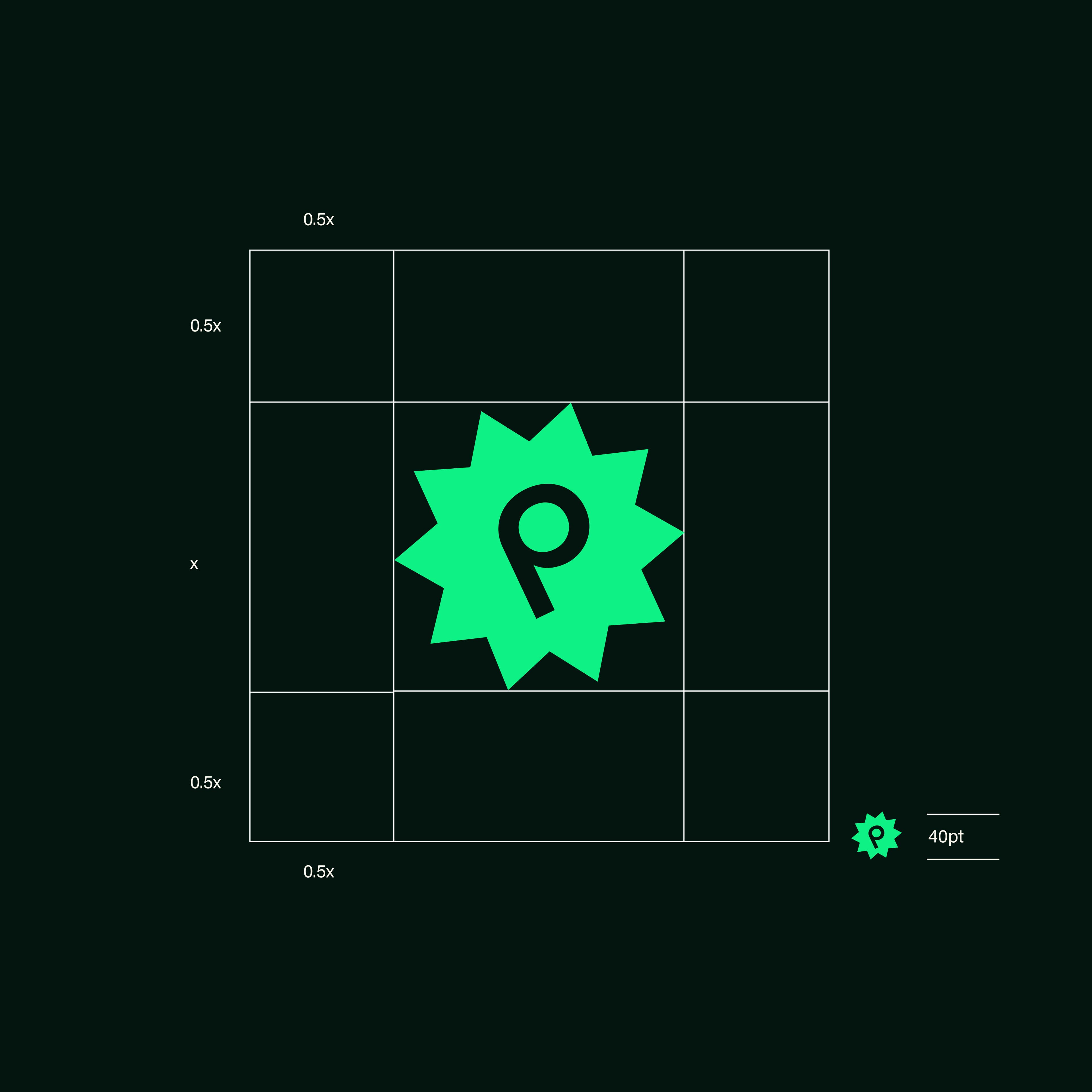
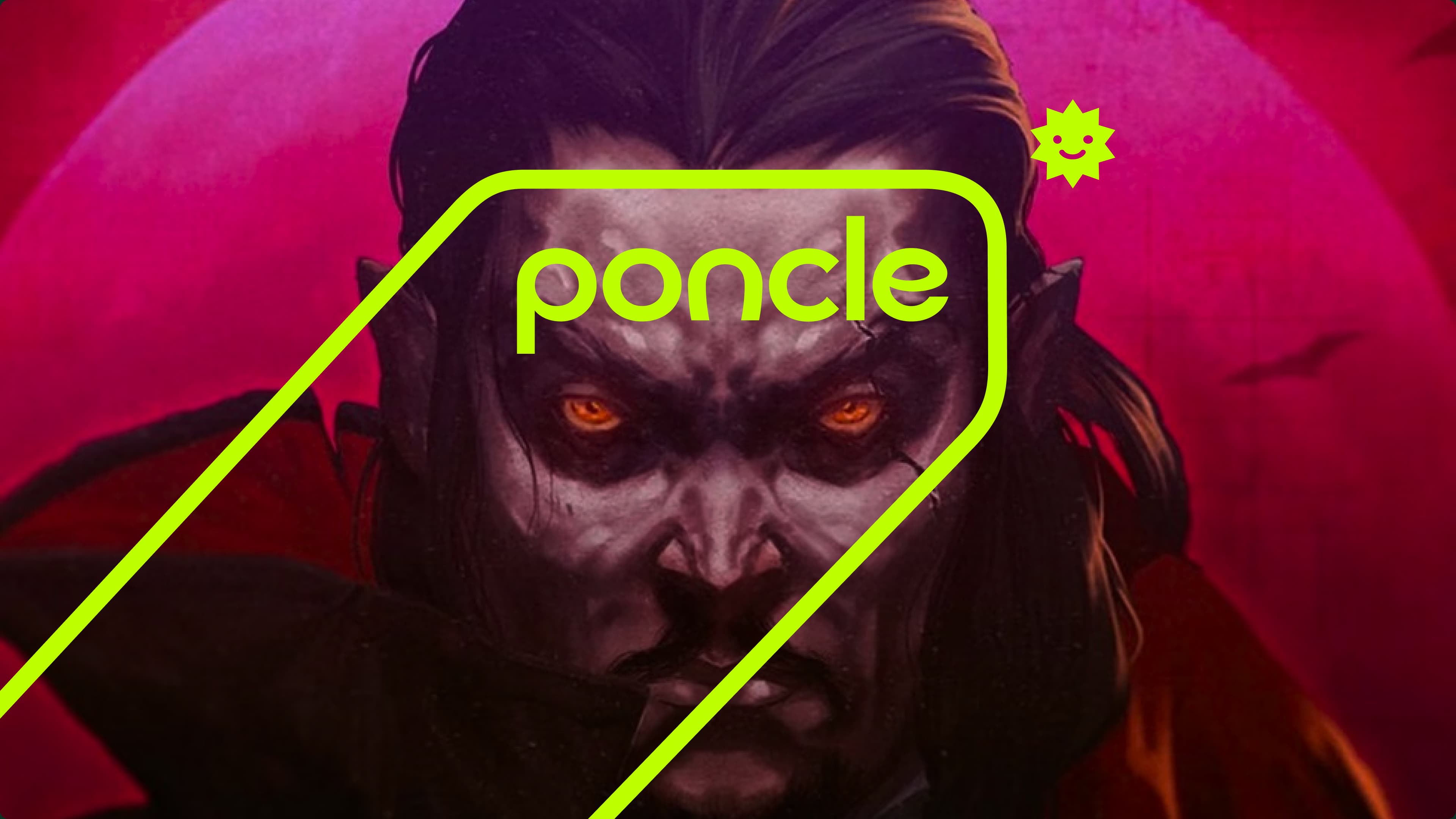
The logo was crafted to be a core branding element to use across all channels. The design is bouncy but subtle, capturing the light-hearted, but modest essence of the Poncle brand.
A key part of the reimagined brand mark was to embody a logo that could be effortlessly combined with partner logos during co-branding endeavours. Together, two logos occupy a singular space, reflecting the collaborative relationship between two brands.
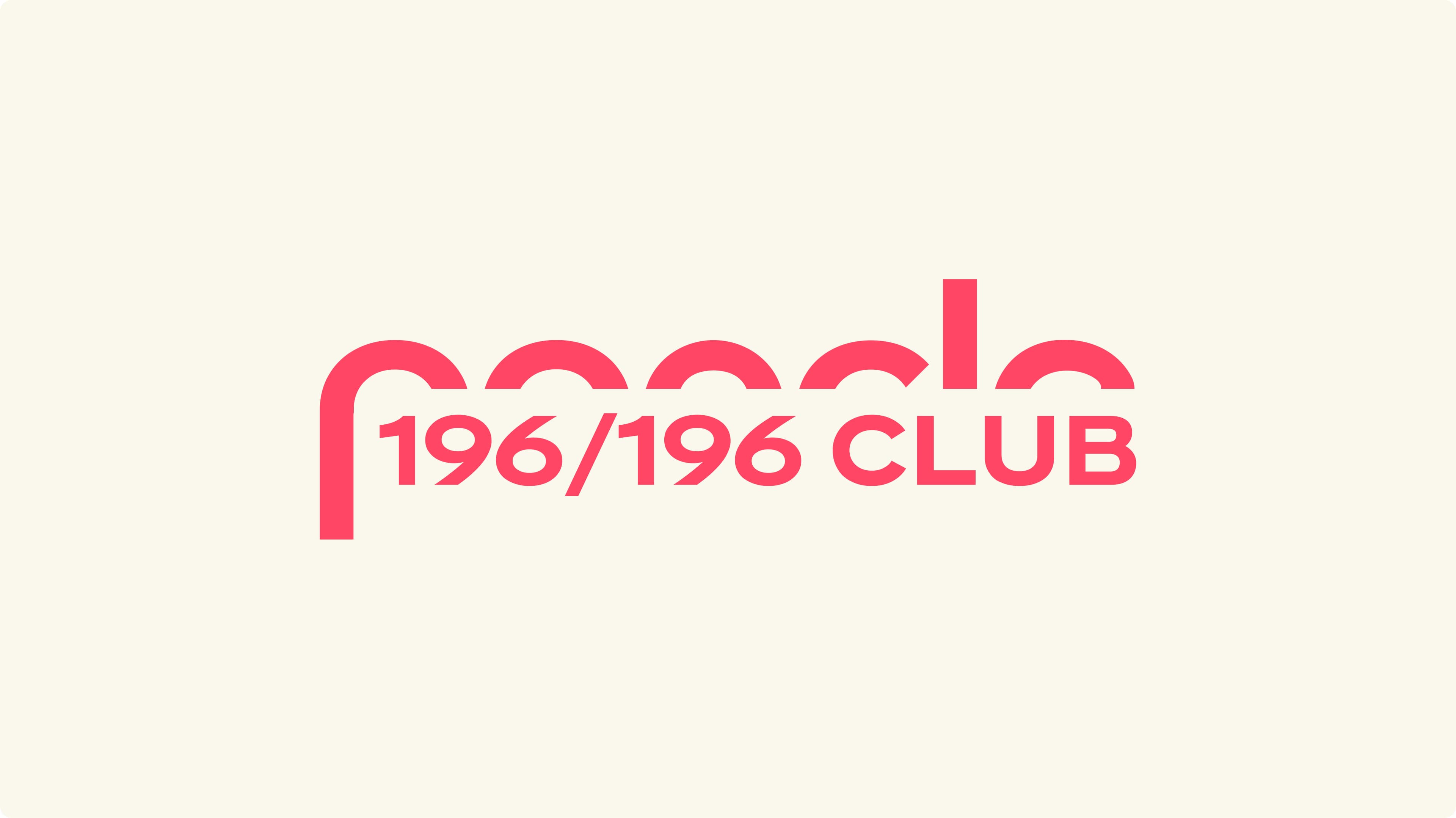
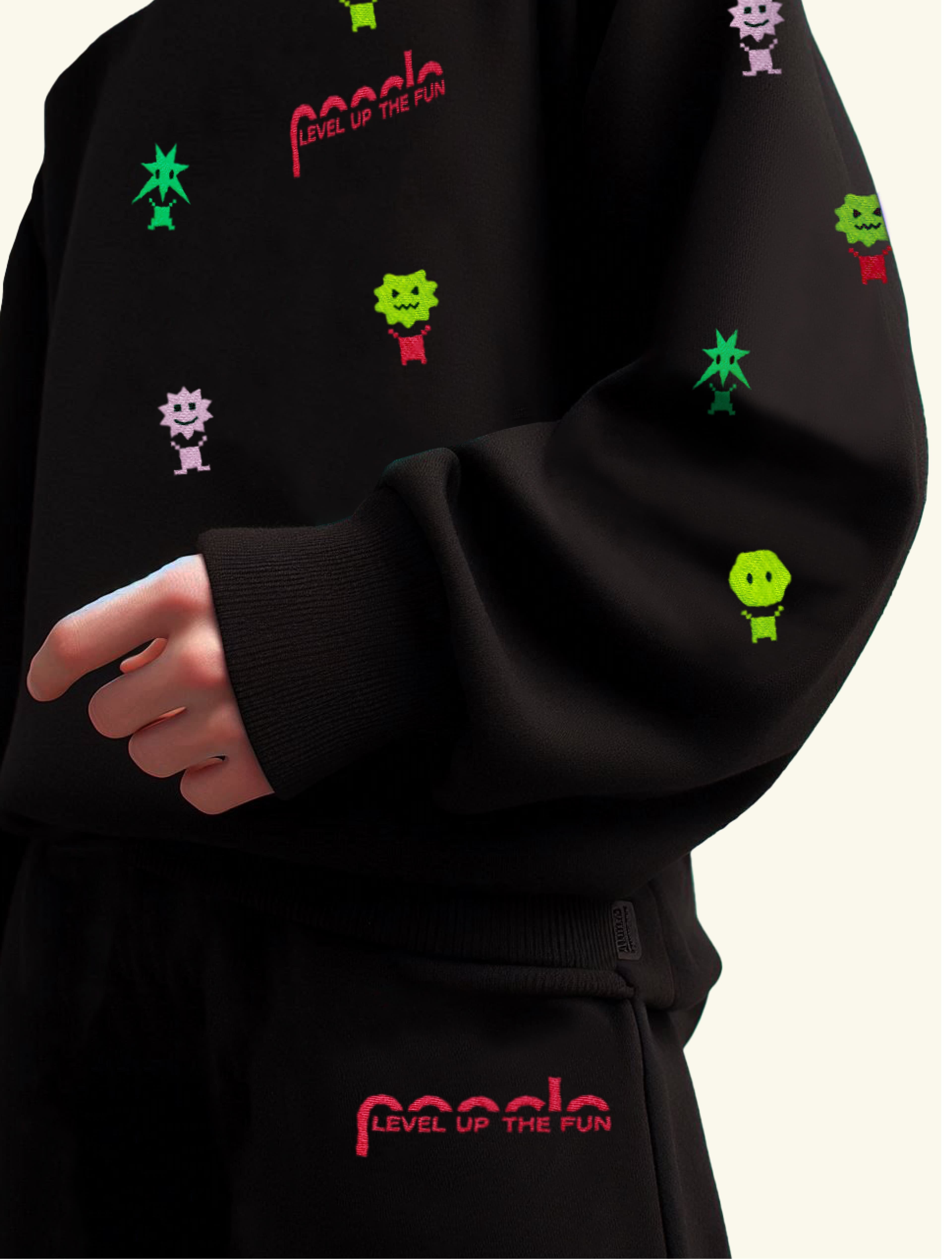
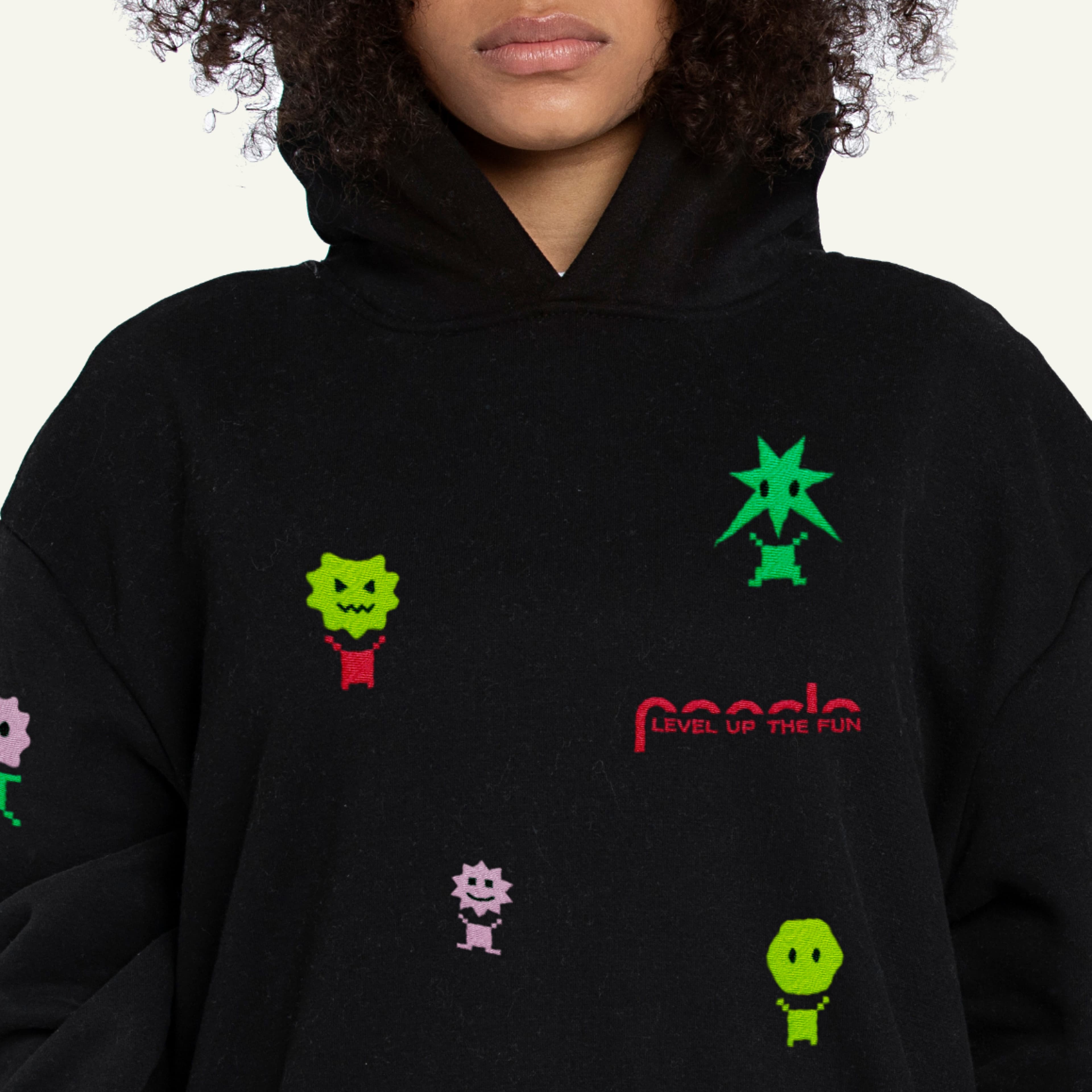
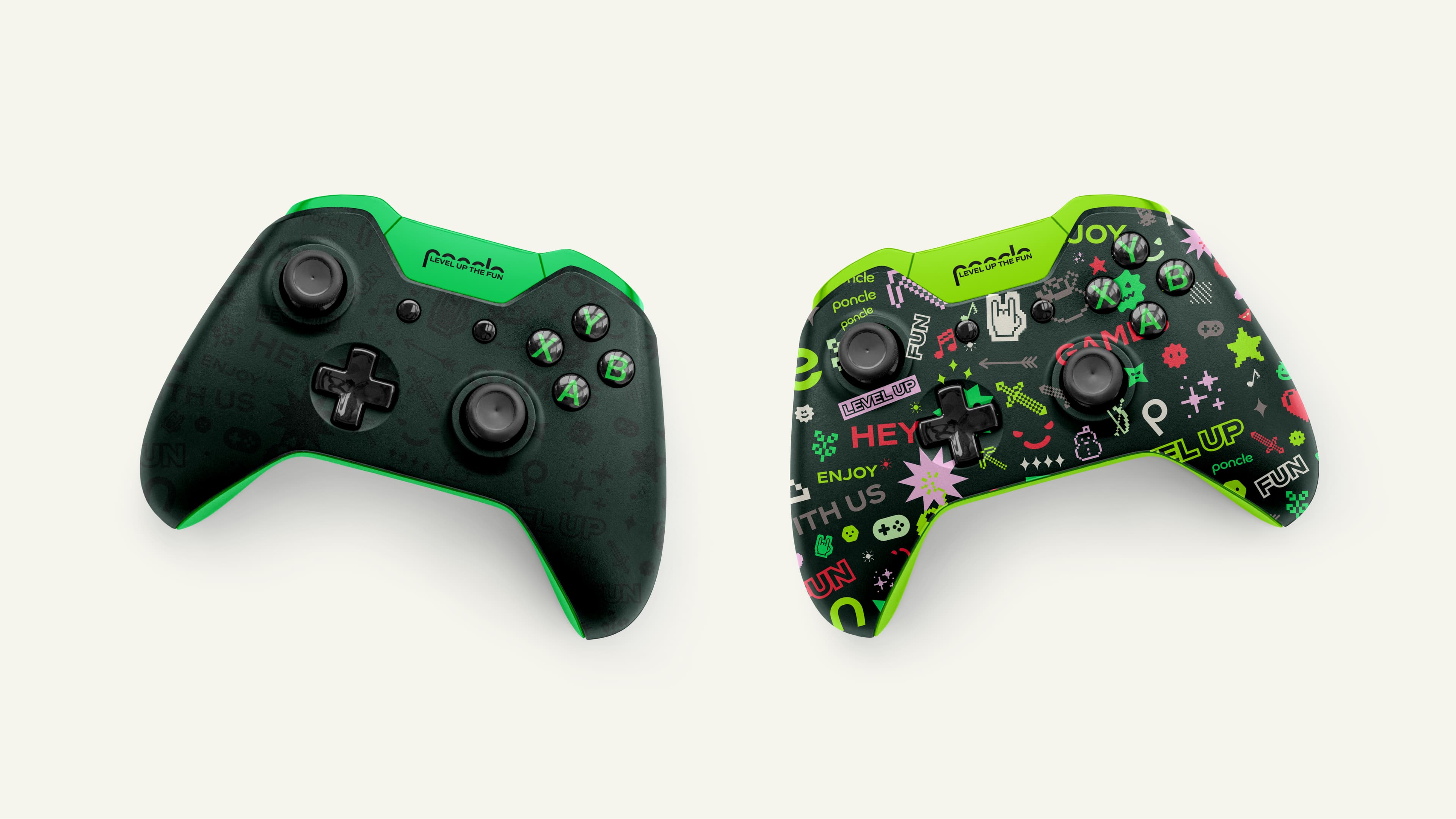
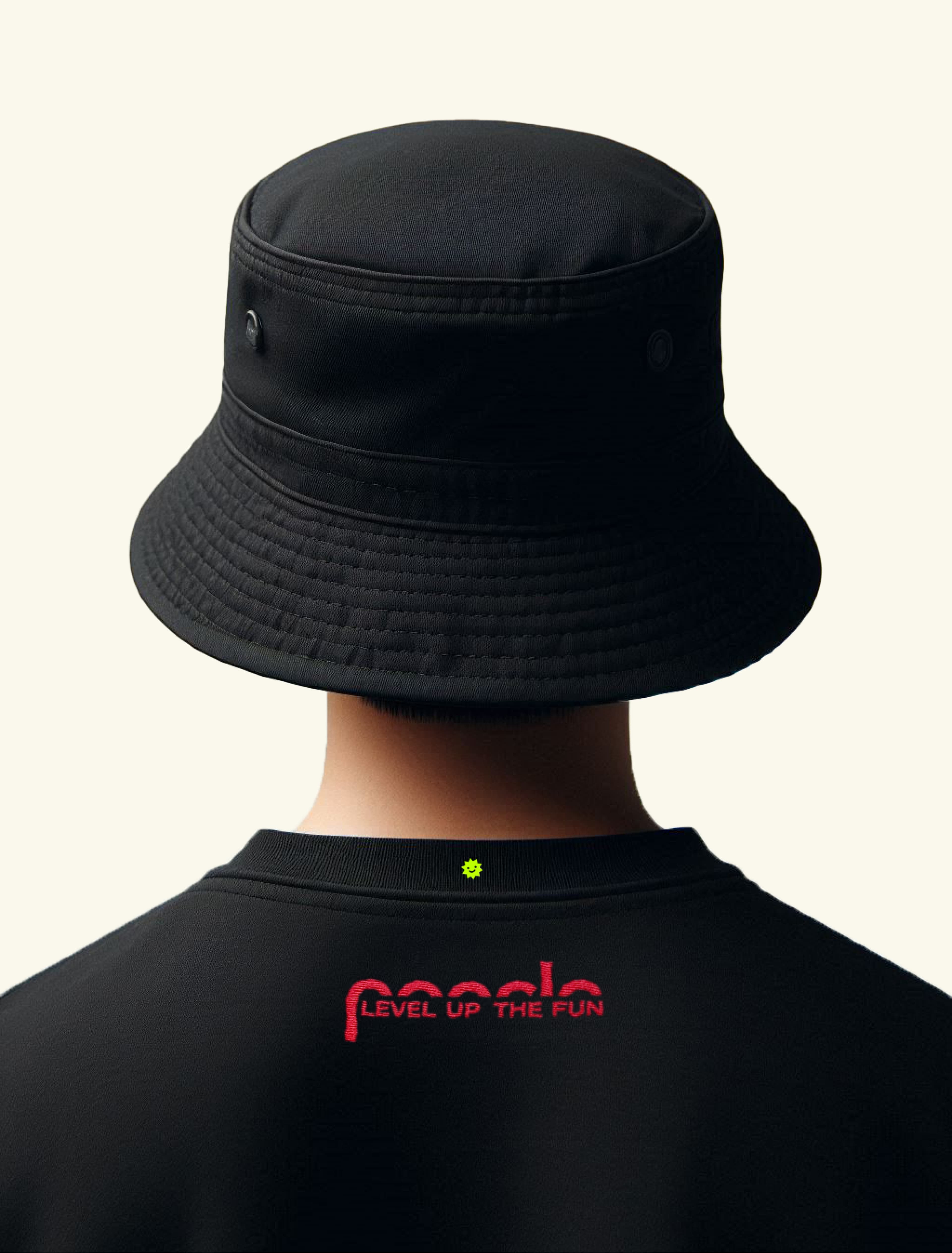
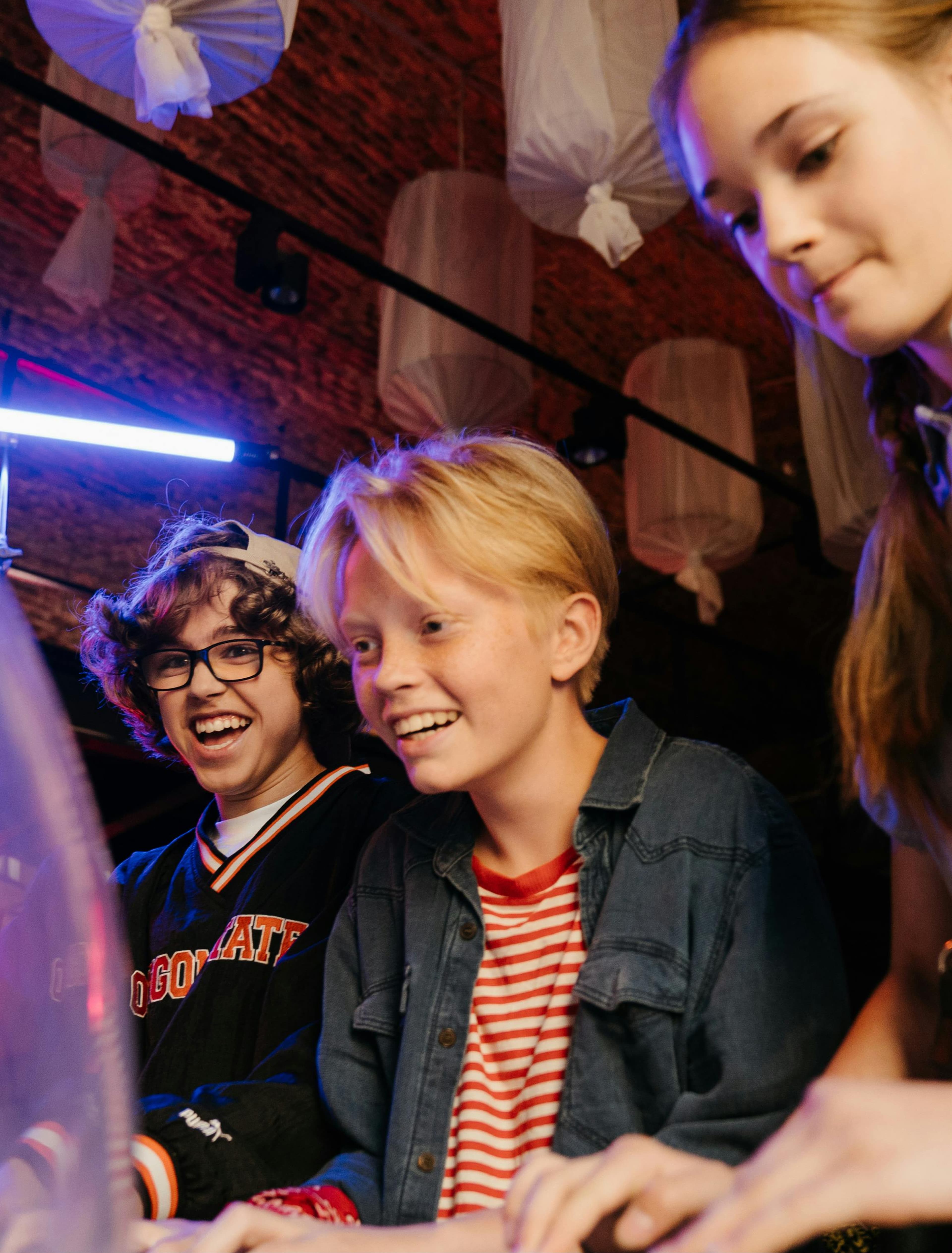
Each deliverable for this project speaks of Poncles’ friendly essence. The imaginative logo and stickers, playful colours and an approachable, but cheeky tone send a message of a more inclusive gaming experience.
With a friendly appearance in mind, we established a brand strategy platform, an identity system, logo and communication tools harmonious with Poncle games, products and merchandise, making the brand appear welcoming and enjoyable to people of all ages and backgrounds. Creating lasting memories beyond the screen.
